Case Study

Designing an interactive video editor for non-experts

Node-based scenes, drag-and-drop widgets, and a visual timeline. Built for people who had never edited video.

Interactive video editor

My Role

Product strategy, Competitive research, UX design

Team

1 PM, 3 developers, 1 UX designer (me)

Timeline

2020–2021

Output

A self-serve interactive video editor + lightbox fullscreen mode for video player.

At a Glance

My company is a video platform for on-demand and live streaming. In 2020 we set out to build an interactive video editor that non-experts could use themselves, in a category that had only ever been built with specialists. I led the design of a self-serve editor with node-based scene connections, drag-and-drop widgets, a visual timeline for timing, and a device preview. The beta shipped in 2021. Five years later, hundreds of interactive videos have been built with it across industries like beauty, e-learning, real estate, banking, and retail.


Context

My company was a B2B SaaS video platform in a difficult market. YouTube and other free platforms dominated the general video landscape, which made differentiation hard for anyone in the paid B2B space. We needed a product that could be marketed on its own, that no one else was offering yet.

Interactive video was a possible answer. The category existed. There were videos with clickable regions, branching narratives, hotspots, and product overlays. But every interactive video on the market had been built by a production team or an agency. The tools that did exist for building them assumed professional users. That left a large group of potential customers priced out or intimidated out of the category.

The bet: build the first interactive video editor a non-expert could use themselves.


The problem

Interactive video is complex by nature. It combines video timing, canvas-based placement, action logic (what happens when a viewer clicks), state (which scene are you in), and playback across different devices. Existing editors reflected that complexity honestly, which is why they needed experts. Our job was to hide as much of it as possible without losing the capability.

Some of the specific problems in front of us:

How do we let someone connect a network of videos without having to teach them what branching narratives are? How do we let them add clickable elements (a button that opens a URL, a hotspot that shows a tooltip, an icon that jumps to another scene) without a lengthy explanation of every possibility? How do we make the whole thing work when it's embedded on customer websites, on both desktop and mobile, without them having to test it themselves?

There was also a broader positioning question. Interactive video is a very general capability. Someone could use it for a product guide, a course, a house tour, or a sales demo. We had to design something flexible enough to serve all of those, without being so abstract it stopped feeling useful.

What We Had to Work Around

  • A category most target customers had never used
  • Playback had to survive being embedded anywhere, on any device
  • A small team of five with a broad scope
  • A one-year beta deadline

Decisions

The trigger was strategic. My company sold a B2B video platform in a market where YouTube and other free players dominated the general audience. Differentiation was hard. We needed a product that could be marketed on its own, something that made someone pause and say "I haven't seen this before." Interactive video was the answer we landed on. A year after we shipped the beta, Vimeo announced they had bought an interactive video company to integrate into their platform. Same bet, one year later.

Decision 01

Node-based scene connections

The Question

How do we let users organize the connections between videos in a way they can actually see?

What We Chose and Why

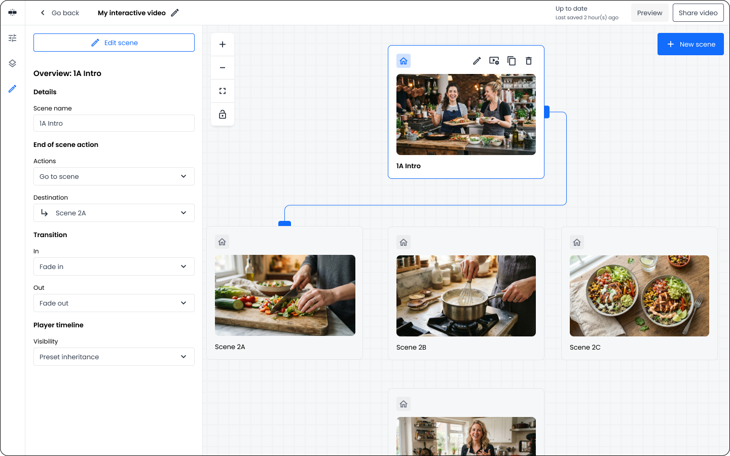
Interactive video branches like a family tree. One intro video leads to three possible follow-ups; each of those can lead to three more. Trying to represent that in a list or a folder would strip out the shape of the flow, which is the most important thing about interactive video in the first place.

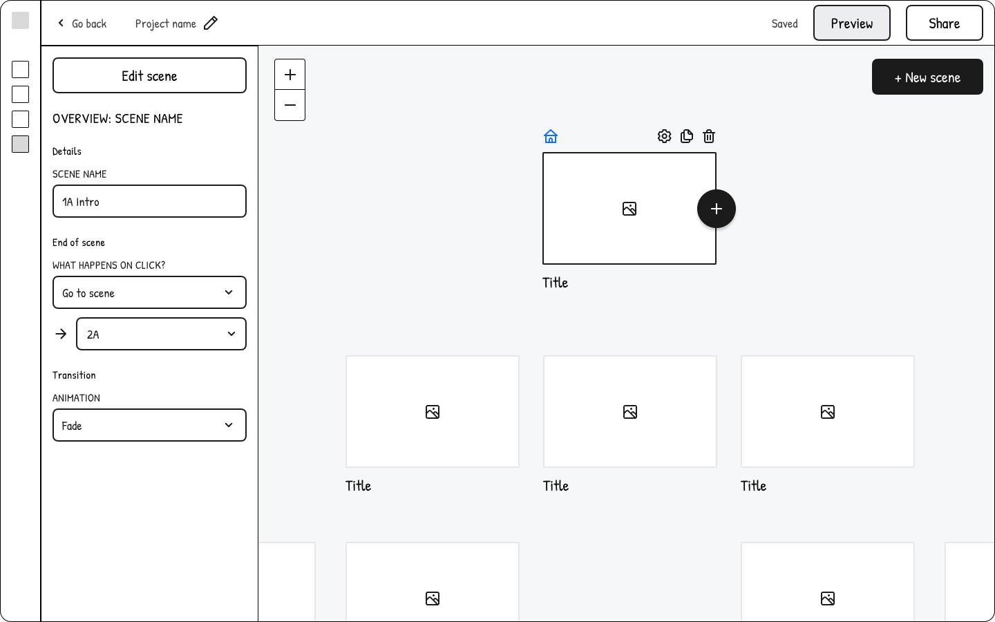
So we chose a node-based canvas. Each video is a node. Connections between them show what plays after what. Node-based editors are a familiar pattern to anyone who's ever mapped a decision tree or a flow chart. Users didn't need to be taught the concept, because the pattern was already in their head. Once they saw their videos as nodes, they could place them out in a way that visually matched the story they wanted to tell.

Node based editing

Node based editing.

Decision 02

Widget types chosen from real use cases

The Question

What kinds of widgets should users be able to add, and why these?

What We Chose and Why

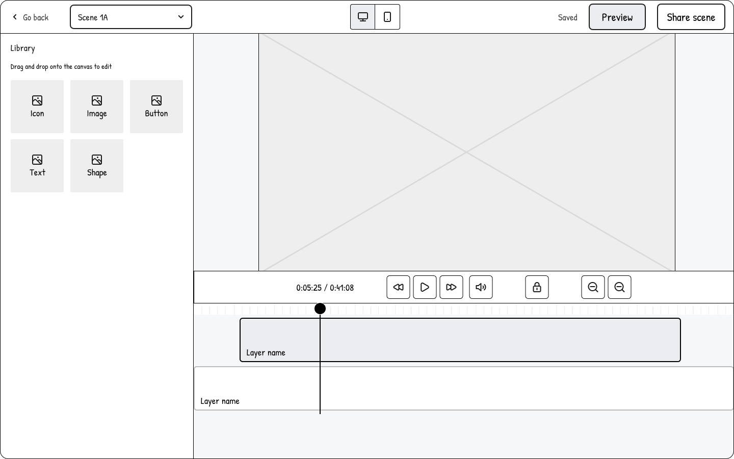
We picked the initial widget set from user research based on what our users usually place in their videos in our classic video editing tool. They would add "lower thirds" (name cards), text headlines and descriptions, as well as images. To fulfill these needs, we added "Image" and "Text box".

"Icon" and "Shape" were added to add access to further detailed design.

"Button" was a unique widget for a video editor, but essential for the interactive format. The button is the best signal to video viewers that something can be clicked on.

Iframes came later, once we understood how much users wanted to build custom interactions we hadn't anticipated. Iframes turned "here are the things you can add" into "here is anything you can add," without breaking the rest of the interface.

Widget library

Widget library.

Decision 03

A visual timeline for widget timing

The Question

How do users control widget timing in each scene?

What We Chose and Why

Numeric input fields work. They also require the user to think in minutes, seconds and milliseconds, which is exactly the kind of friction that keeps non-experts out of video editing.

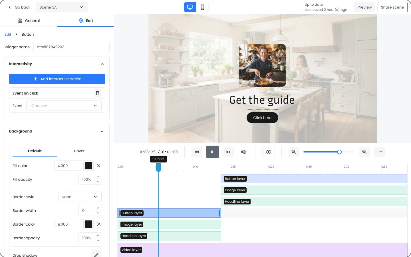
We chose a visual timeline that sits under the video. Every widget in the scene appears as a bar on the timeline, showing when it comes on and when it goes off. Users drag the ends of the bar to change timing. If a widget's bar ends after five seconds, the widget disappears after five seconds. No math, no input fields, no explanation.

We used the same timeline pattern we use in other products in our platform, which gave the whole thing an extra layer of familiarity for existing customers. Additional improvements to the timeline were later added, so users could "snap" layer endings to other layers on the timeline, making precision editing easier.

Visual timeline for widget timing

Decision 04

A device switch for previewing on desktop and mobile

The Question

How do we help users see how their interactive video will behave on the devices their audience will actually watch it on?

What We Chose and Why

Interactive videos live embedded on customer websites. Those websites are viewed on desktop and mobile. A button perfectly sized and positioned for desktop could appear too small on mobile. Users needed to see this before they published.

So we added a device switch above the video. Toggle between desktop and mobile, and the preview updates to match. Users could catch layout issues while they were still editing, not after their audience found them.

Device switch for desktop and mobile preview

The device switch shows a preview of how the video will look on each device.

Decision 05

A custom lightbox for fullscreen playback

The Question

How do we make sure interactive widgets survive when a viewer clicks fullscreen?

What We Chose and Why

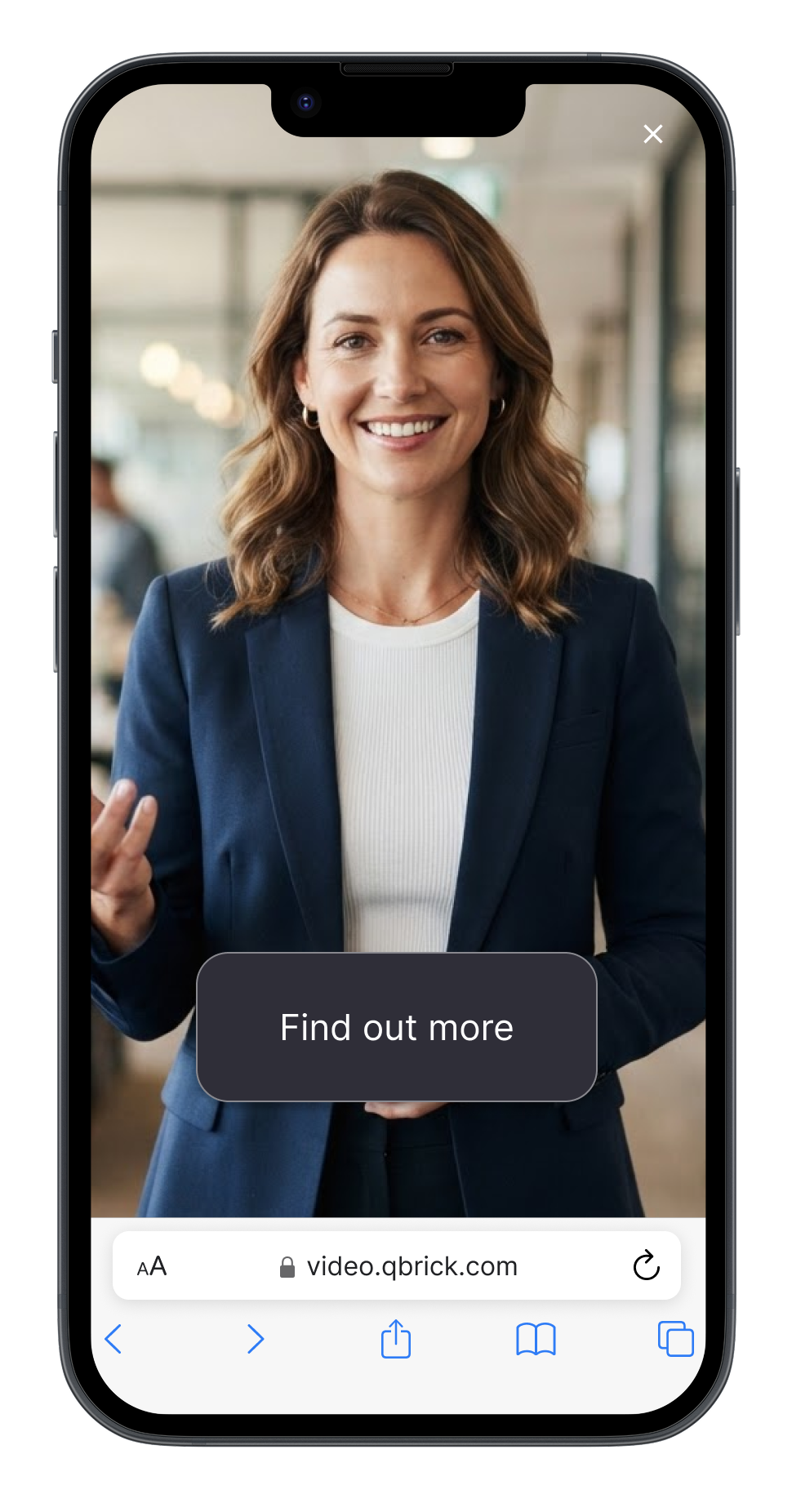
We knew that our embedded player had a flaw when placed on customers' websites. When pressing Fullscreen on mobile, our player would be replaced by the browser's default video player. This would break our interactive features, as that was a unique feature in our video player.

So we built a fullscreen lightbox into our own player. When a viewer clicks fullscreen, the video expands within our controlled context instead of handing off to the browser. Widgets stay where they are. Interactivity survives.

Custom lightbox for fullscreen playback

The shipped solution

The beta shipped in 2021. Five years later, the editor is still actively developed.

Scene organizer. A node-based canvas where users connect videos into flows. Each video is a node; connections show what plays after what. Users can arrange nodes to visualize the entire viewer path.

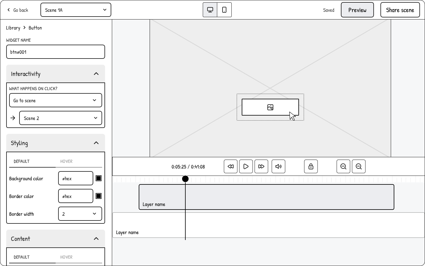
Widget canvas. Inside any scene, users drop widgets onto the video: shapes, text, images, hotspots, icons, buttons, and iframes. Widgets are freely positioned and resized within the video frame.

Widget editing. Selecting a widget opens a side panel with controls for visuals, content, timing, animations, and interactive actions (what happens on hover or click).

Visual timeline. A bar for each widget shows when it appears and disappears in the video. Users drag the ends to change timing.

Animations. Every widget can carry in, out, and loop animations, so interactive elements feel alive rather than static.

Device preview. A switch above the video toggles between desktop and mobile so users can check layouts before publishing.

Custom lightbox player. Fullscreen playback is contained inside our player, so widgets survive rather than getting stripped by the browser.

Live streaming integration. The editor connects to my company's live streaming tool, so interactive scenes can appear in live streams. That path was designed for the live shopping category, which was cresting internationally at the time we built this.

Node based editing on the overview level

Node based editing on the overview level.

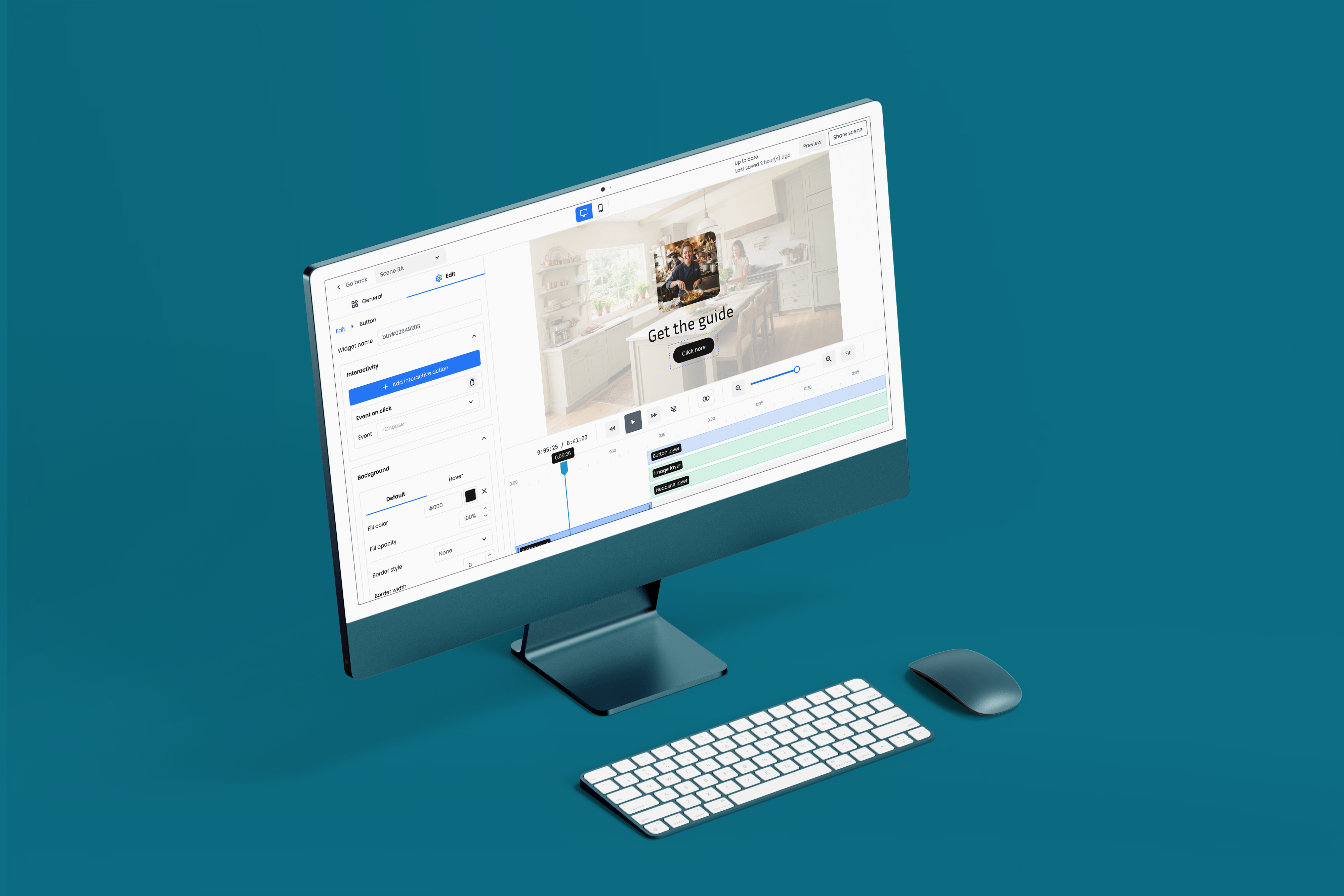
Interactive video editor: Inside a scene

Interactive video editor: Inside a scene.


What happened after we shipped

Adoption across industries. Hundreds of interactive videos have been built with the editor across use cases we anticipated and some we didn't: beauty and clothing product demos, furniture and real estate walkthroughs, influencer marketing, e-learning, banking product explainers, retail sales demos.

The live shopping hypothesis proved right. Before we launched, we bet that live shopping wouldn't land in Sweden the way it had in China. That turned out to be accurate. Swedish buyers prefer to take their time researching, and live-only sales moments don't fit that pattern. Live shopping never took off here. The companies that bet entirely on it are down to a handful of customers today.

The market pulled us toward informational content. On-demand shopping didn't take off either, which was less expected. Instead, the market moved toward informational content: product explainers, how-to guides, and brand stories with "learn more" paths built in. Interactive video became a way to extend the sales funnel through education, rather than a way to close a sale directly. That fits Swedish buying culture (take time, investigate, decide) and it's the use case we've grown into.

Category validation. A year after we shipped the beta, Vimeo announced they had acquired an interactive video company to integrate into their platform. The same bet, made a year later.

Continued development. Five years in, the editor is still shipping updates. That's the mark of a product that landed.


Learnings

Users don't know your tool's sweet spot until they exceed it. We designed the editor for interactive videos in the range of 20 to 40 scenes with a few options each. Most product demos, courses, and walkthroughs fit comfortably in that range. But some customers came in wanting to build 100+ scenes with 5+ interactive options per scene, ambition that used to require a production team. At that scale, the editor became sluggish and the experience shifted from empowering to frustrating. We ended up building many of those larger projects on customers' behalf. The takeaway isn't that we should have built a bigger, faster editor. It's that when you make a capability self-serve that used to require experts, non-experts arrive with more ambition than the tool was designed for. Marketing, demos, templates, and onboarding all need to communicate what the tool is optimised for. Otherwise you either build for the largest ambition users bring, or you end up building projects on their behalf.

Familiar patterns work, even for unfamiliar problems. Node-based editors are a recognisable shape. Anyone who has mapped out a decision tree or a flow chart has seen one. Interactive video was, for most of our users, a new medium. But the moment they saw their videos as nodes with lines between them, the concept clicked. The pattern did most of the teaching. Novel capabilities don't need novel interfaces. Familiar interfaces are what make novel things feel approachable.

Read the market you're in, not the market you're chasing. We built the editor while live shopping was cresting internationally. It was tempting to design the whole product around that use case, because that's where the noise was loudest. We took the softer bet: interactive video should serve on-demand first, live shopping second. Live shopping never took off in Sweden. Buyers here take their time, research before purchasing, and prefer to engage with information rather than being sold to in real time. That cultural read shaped which use cases we prioritised, and it's why the product is still around today while several live-shopping-only companies have folded or moved abroad. Hype tells you what's possible somewhere. It doesn't tell you what will work where you're actually selling.