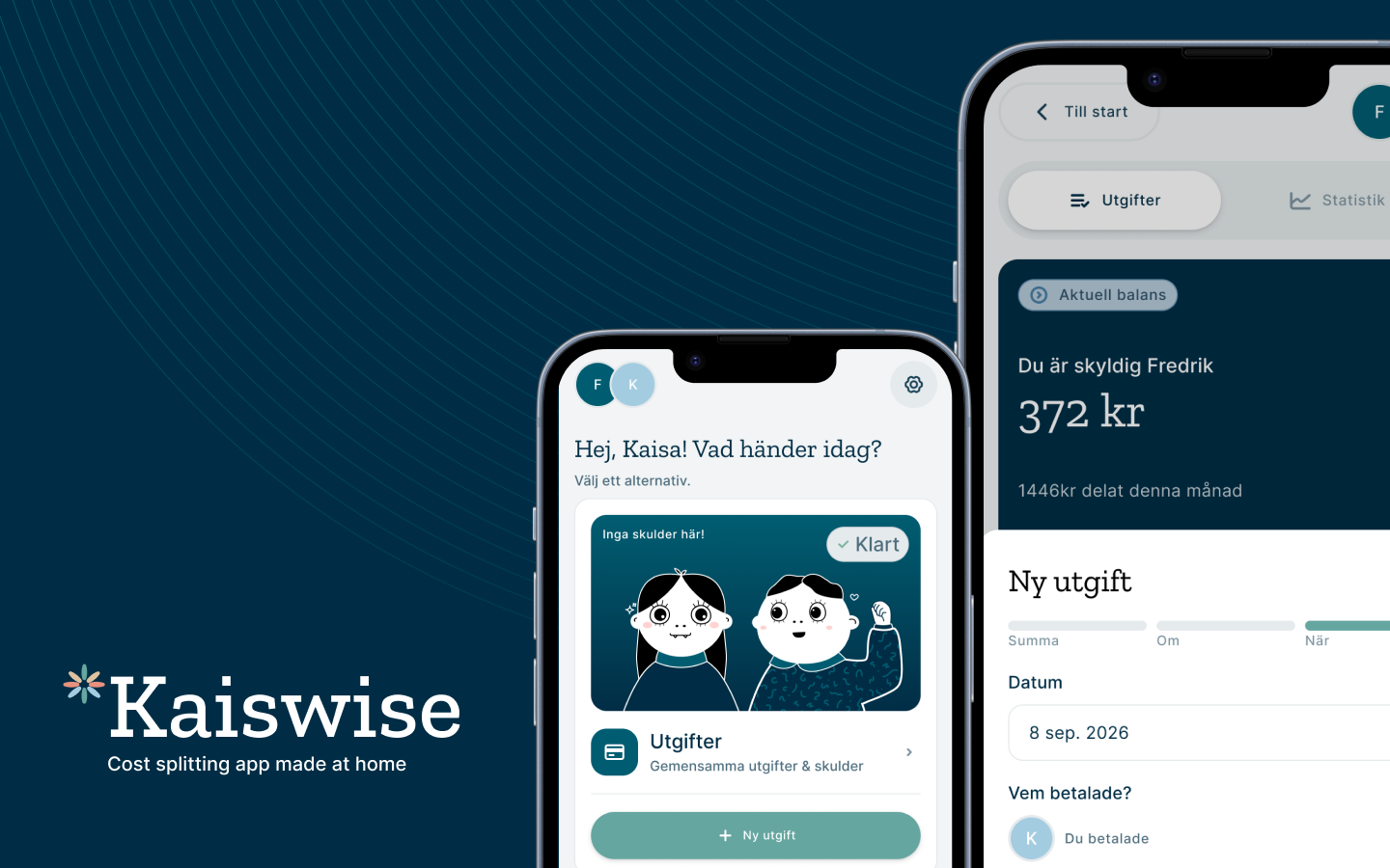
Where it started
For years, my fiancé (Fredrik) and I split our shared costs using an app called Steven. It was simple, focused, and did exactly what a couple needs: quick expense entry, clear balance, and no fuss. Then, a couple of years ago, it quietly stopped working. Development stalled, syncing became unreliable, and eventually we couldn’t trust it to hold our numbers anymore.
We switched to Splitwise out of necessity. It works for what it is, but it isn’t built for a couple who share almost everything, all the time. It’s designed around groups and events – a ski trip, a shared house, a one-off dinner. When your “group” is your household and your “event” is every single day, the whole interaction starts to grate. Adding an expense takes more taps than it should. The free tier caps how many entries you can log per day, which feels absurd for people trying to keep track of daily groceries. And there’s nothing personal about it – it’s a utility, and it feels like one.
After a few months of frustration, Fredrik said “we should just build this ourselves.” And since Claude had gotten good enough to write functional apps end-to-end, the barrier to “just building it” was suddenly a weekend of work instead of a project we’d never finish.
So we did.
Scoping it out
Before Fredrik started building, we sat down at the kitchen table and wrote out what we actually needed the app to do. Nothing fancy, just what would solve our specific frustration with the other apps we’d tried.
What made the list
- Add an expense (amount, description, when it happened, whether it was split 50/50 or custom)
- See at a glance what one of us owes the other
- Settle the debt when we’re even
- View past expenses and know which are settled and which aren’t
- Simple statistics for how much we’ve spent together per week, month, or all-time
What we deliberately left out
- Multiple accounts or groups. This app is for the two of us. Adding “invite others” logic would have doubled the complexity for a feature we’d never use.
- Direct payment integration with Swish. Real Swish API access requires a paid business account and legal agreements, which we weren’t going to set up for a personal project. Instead, “Betala nu” would show us the amount to send manually, and we’d handle the actual transfer in Swish separately.
With the scope decided, I sketched the flow so we could both agree on how the app would hang together before Fredrik went to Claude to create an advanced prototype.
Since we didn’t have an idea for the app name yet, Fredrik chose the working name “Kaiswise”.
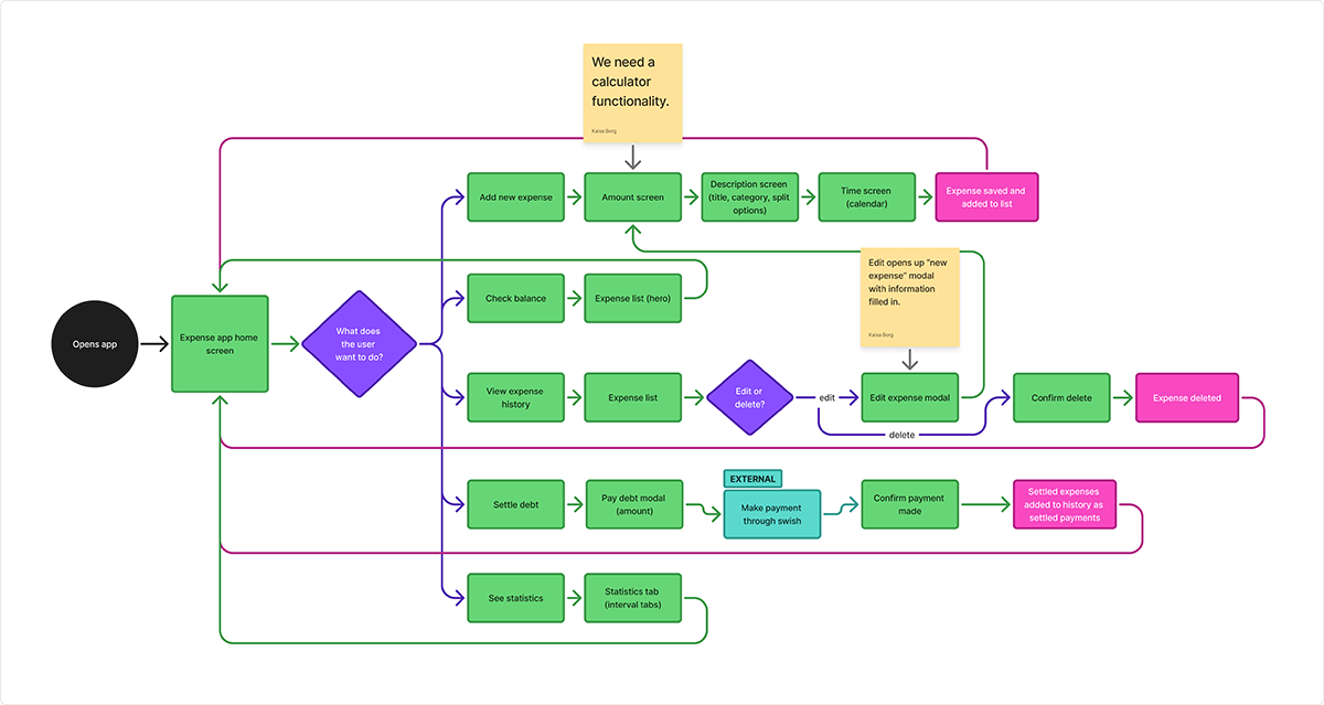
User flow showing the main features we wanted.
Work in progress
Prototype
Claude’s version
Fredrik built the whole app with Claude in a weekend. He didn’t give it a design brief, so Claude picked its own defaults: warm neutrals, cream backgrounds, dark navy sections, terracotta accents. It’s the aesthetic you’ll recognize from a lot of Claude-built apps these days – clean and polished, but anonymous.
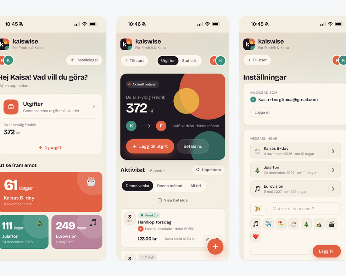
Advanced prototype built by Claude.
We used this version for a few weeks. It worked. We logged expenses, checked balances, settled up. We even added features iteratively as we noticed what was missing – categories for our purchases, auto-suggested descriptions based on previous entries, auto-selected categories based on keywords. Every time we found something we wanted, Fredrik added it with Claude the same day.
So the prototype did exactly what a prototype is supposed to do: it validated that the feature set was right and the flow made sense, before I spent a single hour in Figma.
But every time I opened the app, it felt like using someone else’s tool. It looked like every other Claude-generated app I’d ever seen. It didn’t look like ours.
Making it ours
Building the foundation for a re-design
A refined color palette. I moved from Claude’s defaults to a colder, ocean-themed set of tones with a specific personality: deep teal-navy, terracotta, warm sand, muted rose, mustard yellow.
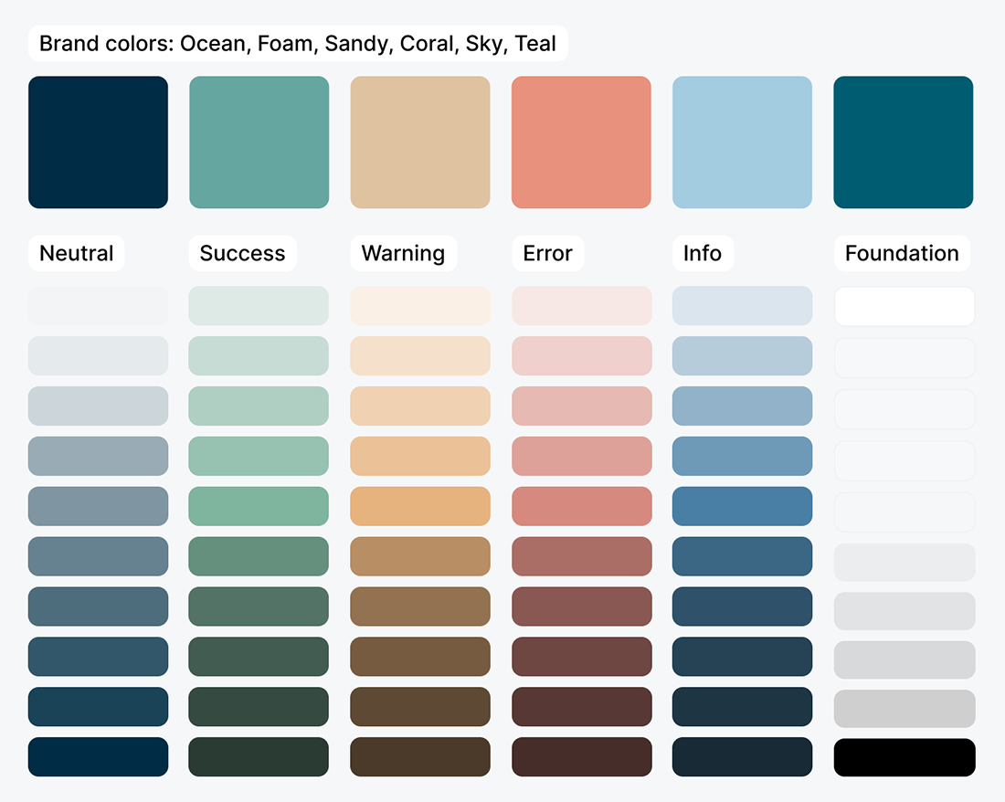
Color scales.
A new typography scale. I introduced Zilla Slab for display type – a warm, editorial serif that gives the app a bit of magazine energy instead of pure SaaS. Body copy stayed in Inter for legibility. The pairing gives every screen personality that Inter alone couldn’t.
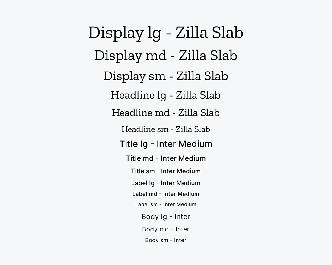
Typography scale.
Custom illustrations of us. To have a bit of fun, I drew illustrated versions of Fredrik and me, heavily inspired by Spöket Laban. And here’s the fun bit: the illustration on the balance card changes based on who owes money. When I owe him, I’m mad. When he owes me, he’s sad. Small detail, but it makes the whole app feel like a joke between us instead of a utility.

Custom illustrations.
A new icon library. I swapped Claude’s defaults for a consistent set. The icon set is available as a community asset in Figma, and it’s called “Coolicons”.
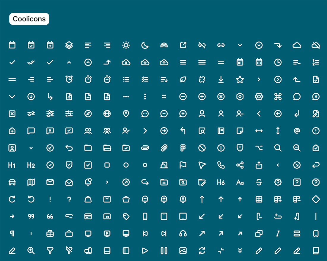
Icon set.
A mini design system. Tokens for colors, typography, spacing, border radius. Reusable components for buttons, cards, list items, form fields. Overkill for a two-person app, maybe – but I wanted iteration to be easy and consistent (plus it was fun).
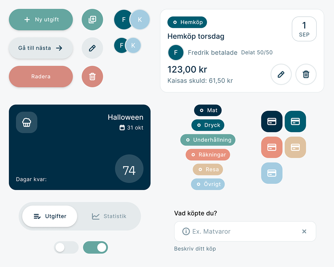
UI Kit.
Fredrik then rebuilt the app to match my Figma screens. The version we use today is the redesign.
Finished product
After a few weeks of using Claude’s version and iterating on features, I redesigned the app to look like ours. Same features, similar flow (with a few tweaks) – just with the identity it was missing.
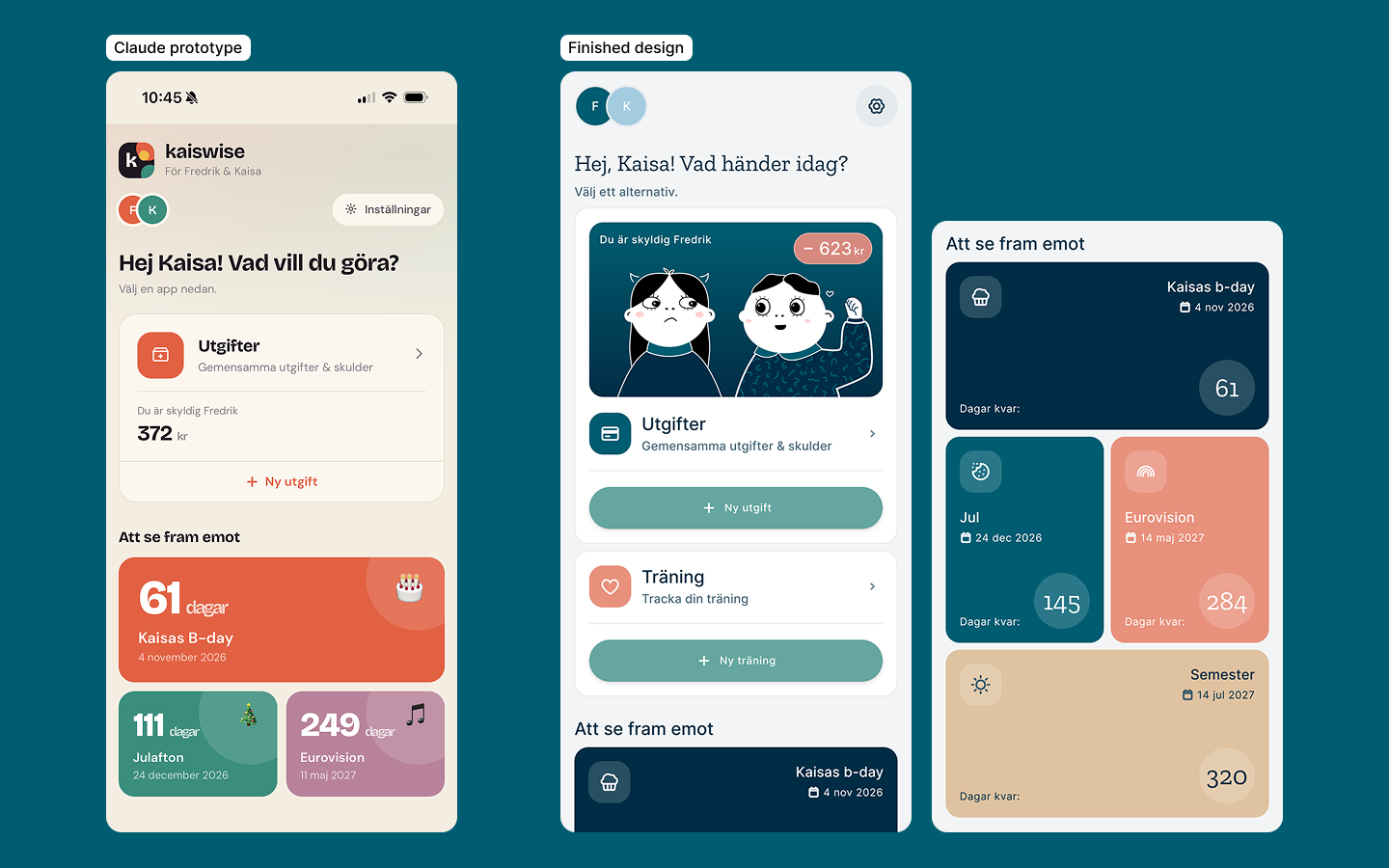
Homescreen. Claude vs. new design.
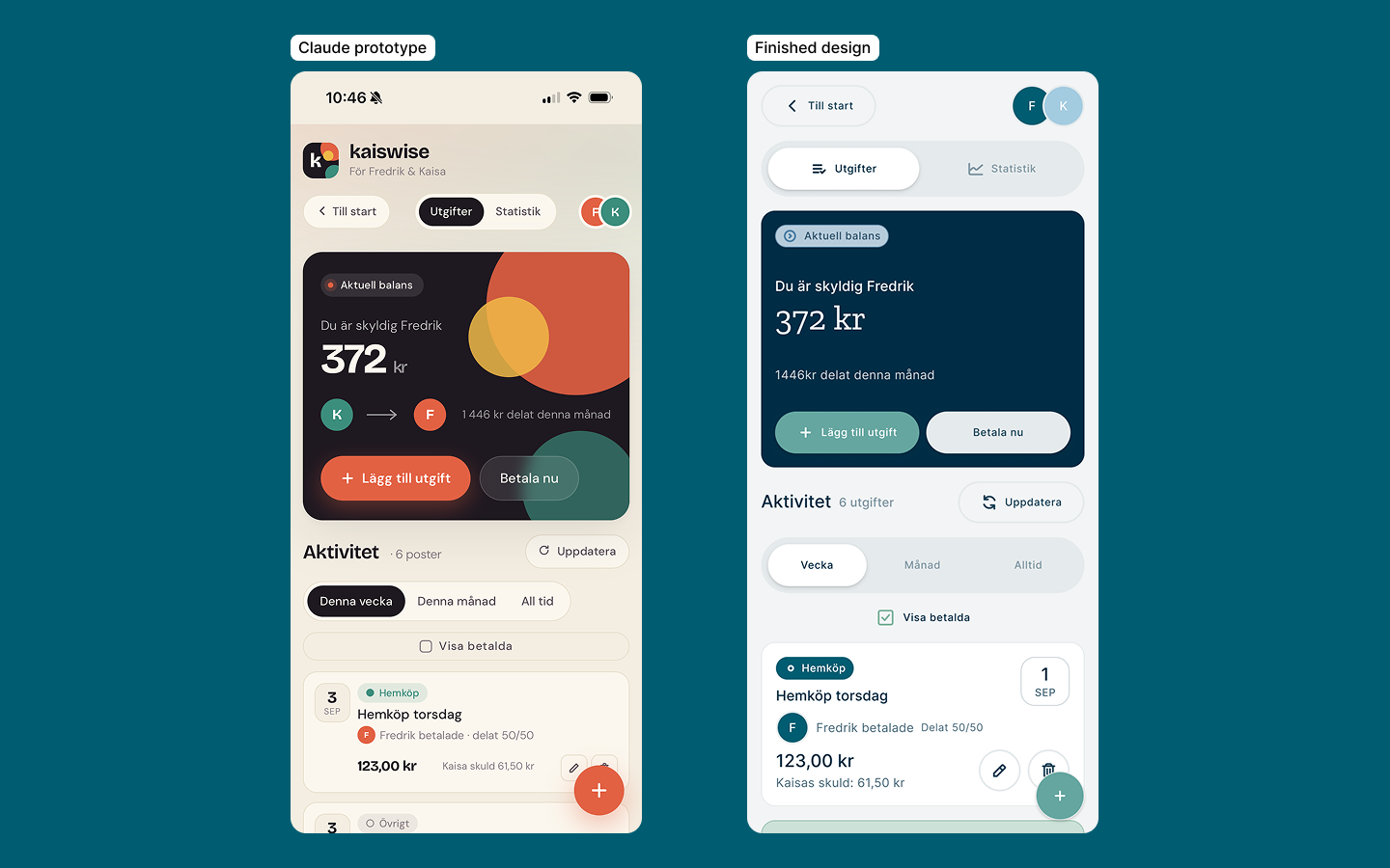
Expense list. Claude vs. new design.
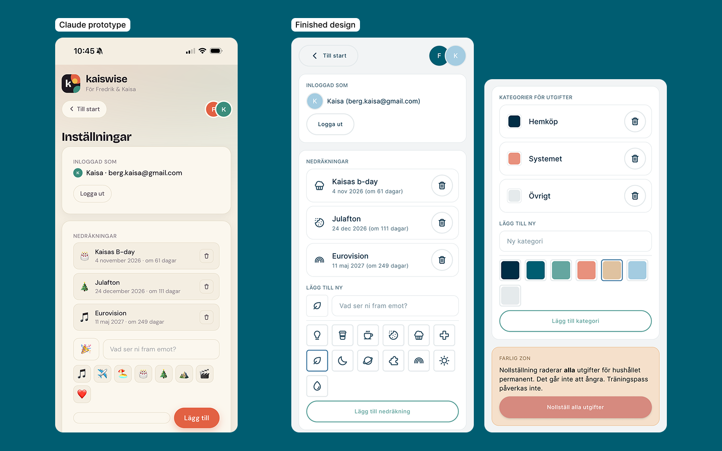
Settings. Claude vs. new design.
Closing thoughts
We’re at a strange, wonderful moment where couples and families can just build their own apps. A few years ago, an app like Kaiswise (better name still pending) would have needed a developer, a designer, weeks of coordinated work, and a hosting bill. Now it takes two people, an evening at the kitchen table, and a subscription to Claude.
I’m not going to pretend that’s the same as a “real” app. If I could snap my fingers, ours would connect directly to Swish, sync automatically, and have proper backups. But most of the time, we don’t need any of that. We need to know what one of us owes the other, and we need to be able to fix it. Our little homemade app solves that, and it looks like ours.
For a personal project between us, that’s enough.