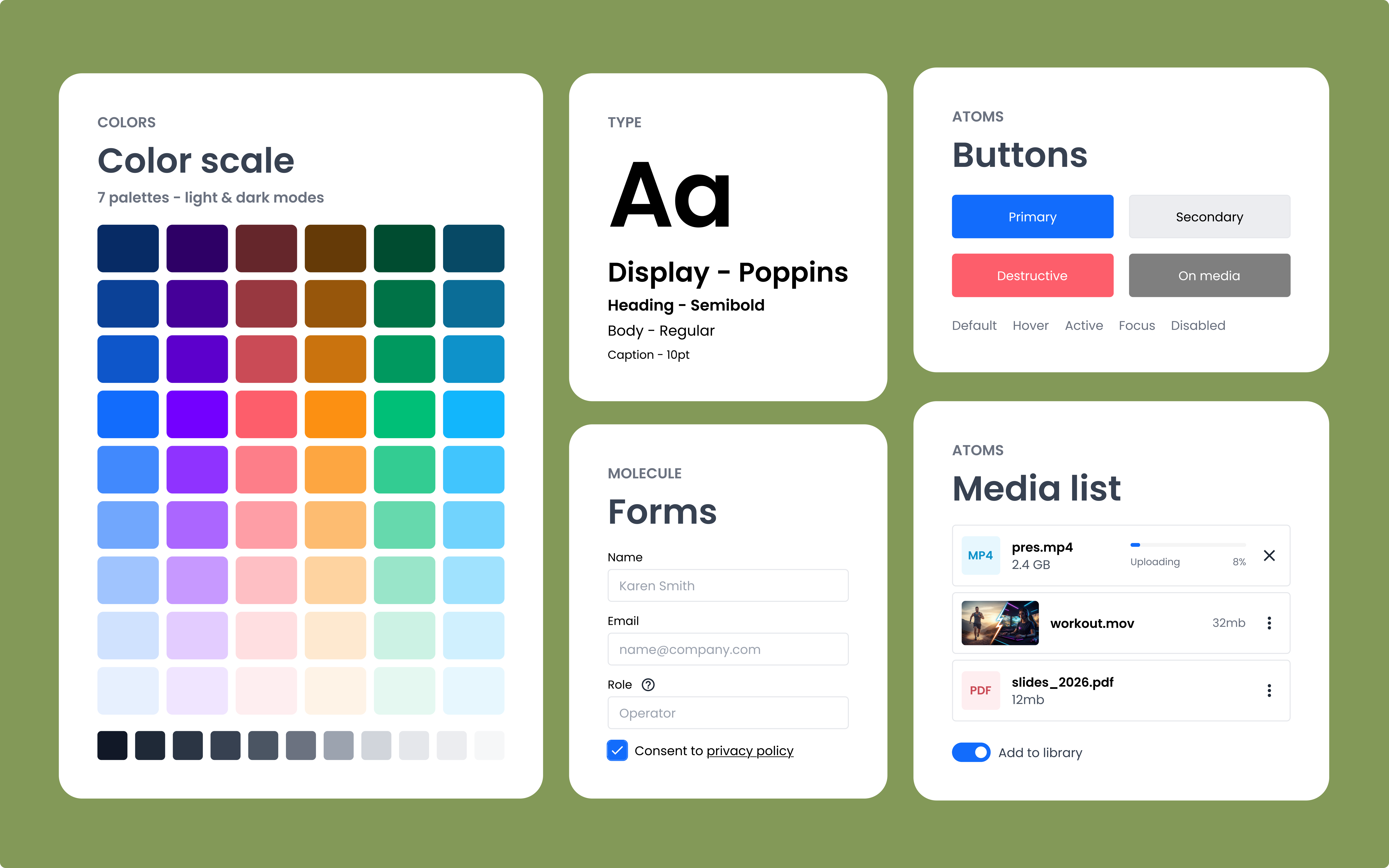
At a Glance
My company is a small SaaS company building a multi-product video platform. For years, we shipped without a shared visual or component language, which meant designers and developers rebuilt the same things over and over while customers navigated inconsistent experiences across our products. I designed and built Qbrick's first design system: a semantic token layer with light and dark modes, a component library covering states and sizes, and a starter set of page templates. It is now the foundation new work is built on, and continues to grow over time.
Context
Qbrick builds video infrastructure for enterprise customers, covering streaming, editing, media management, and publishing. As a smaller company shipping several products on tight deadlines, our culture has always favored speed. Designers and developers get pulled across projects, releases stack on top of each other, and decisions move fast. For a long time, that worked. But it also meant we never paused to invest in shared foundations. By early 2025, the cracks were showing.
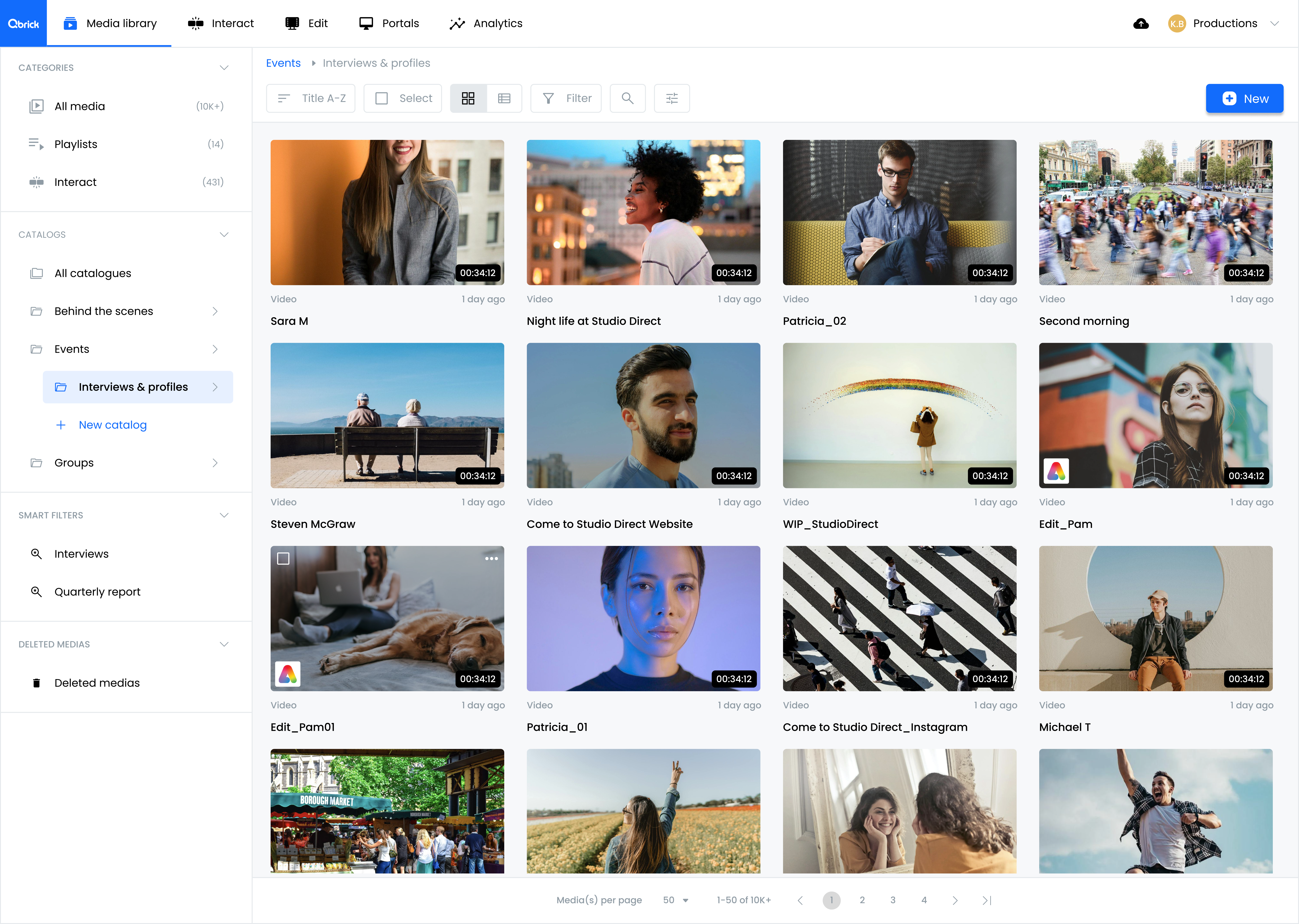
The Qbrick platform.
The problem
Without a design system, every team was solving the same problems independently.
Developers had no canonical components to pull from, so they either built from scratch or borrowed from public libraries and adjusted to fit our brand. The result depended on who was building, which meant our buttons, modals, and form inputs varied in style and behavior across the platform. Time that should have gone into perfecting the user experience went into rebuilding the basics a thousand times over.
For designers, the cost was time and confidence. No token system, no color or typography scale, no shared library. Every screen started from zero, or from a hunt through old Figma files for something close enough to copy. Spacing was inconsistent because every value was typed by hand. Final designs rarely matched the original vision because so much energy went into reassembling the basics.
The cost landed hardest on our customers. One product asked them to upload an image, another asked for a URL. A video timeline that felt intuitive in one editor felt clunky in another. Customer support spent significant time guiding users through inconsistencies that should not have existed. Leadership felt the pressure from customer feedback but didn't have visibility into where in the design and development chain the problems were coming from.
Components and designs were being pulled together with shoestring and glue. Something had to change.
What I Had to Work Around
- Designers and developers building from scratch every time
- No token system, no color or typography scale
- Inconsistent spacing, sizing, coloring, logic
- Confused customers, overworked customer support
The decisions that shaped my work
The trigger was personal. My PM, my closest collaborator for years, was leaving the company. I started thinking about what it would take to onboard someone new into our current way of working, and I realized it was nearly impossible. Around the same time, leadership was ramping up the pace of new features and products. We needed sturdier ground to stand on. So I made the call to start.
Decision 01
Token architecture
The Question
How should I structure tokens so the system stays flexible as Qbrick grows and our needs change?
What I Chose and Why
I knew this system would need to evolve. Qbrick had never had a design system before, and I wanted to build something future designers could extend without ripping out foundations. So I built tokens as semantic layers: a base palette underneath, and a mapped collection on top with names like "hover," "hover-light," and "surface-default" that describe intent rather than value. When a brand color changes, or when a new use case appears, the mapped layer absorbs the change. The components above don't notice.
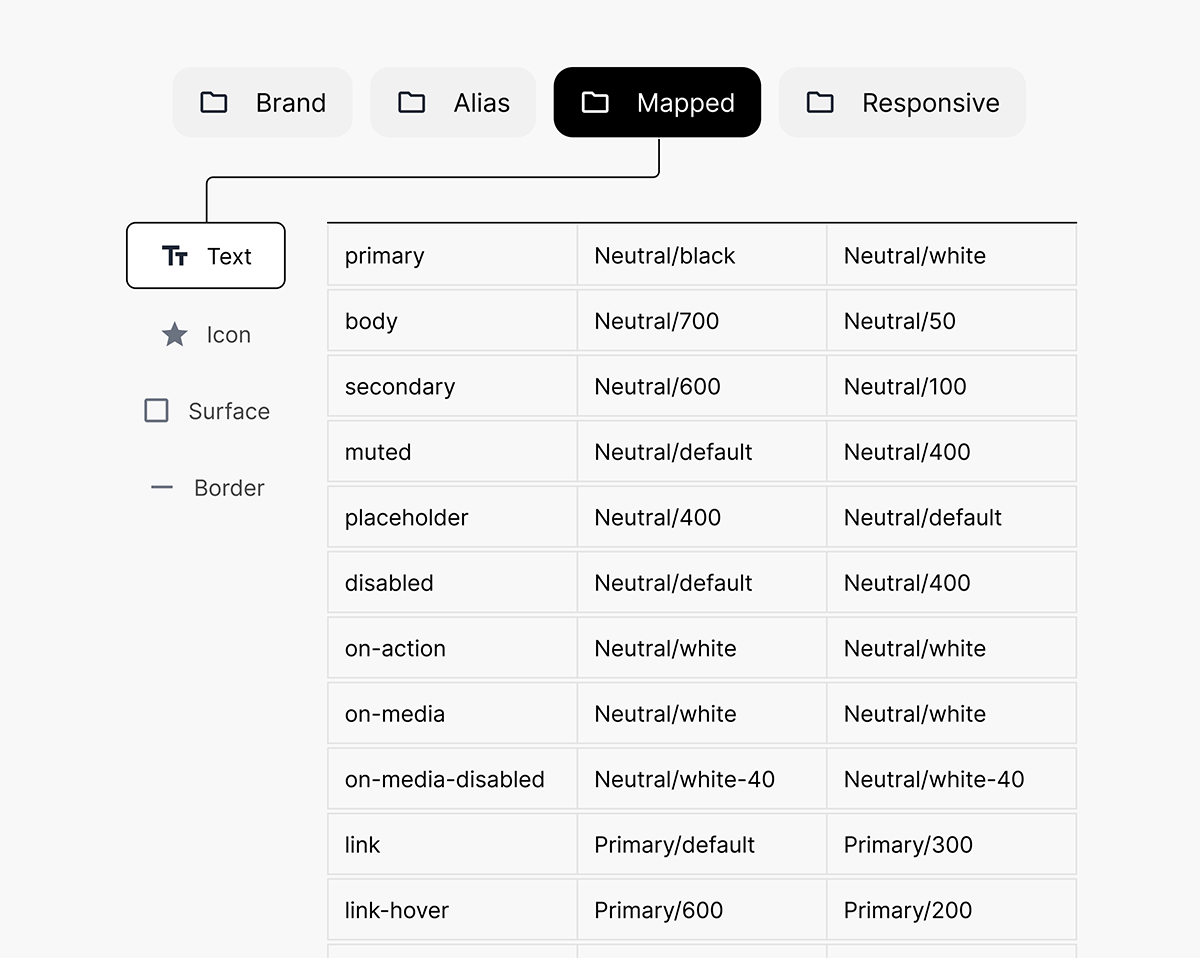
Token library
Decision 02
Build order
The Question
What should I build first, primitives or patterns?
What I Chose and Why
I started with primitives (buttons, inputs, labels) before patterns (forms, cards, tables). The metaphor I keep coming back to: gather all your ingredients before you start baking the cake. Building primitives first meant that when I moved up to patterns, every decision about composition was already grounded in the system.
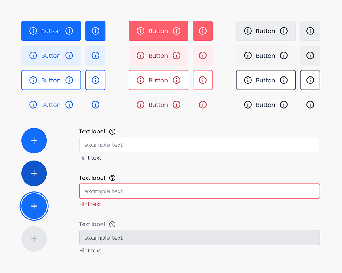
Primitives: Buttons and Icon Buttons
Decision 03
Ownership model
The Question
Who decides what goes in the system?
What I Chose and Why
I'm currently the only dedicated UX designer at Qbrick, which means I made every call myself. That's not how design systems usually get built, and it's not how I'd build one in a larger organization. But in our context, it was the fastest path to consistency and the highest chance of the system actually shipping. I have the deepest knowledge of how our platform fits together, and I was best positioned to make sure the system honored what already worked while improving what didn't.
Decision 04
Custom system vs. adopted system
The Question
Should I adopt an existing design system, or build a custom one for Qbrick?
What I Chose and Why
I considered adopting an existing design system and adapting it, but leadership wanted Qbrick's visual identity and "feel" preserved. That ruled out a straight adoption. Instead, I studied Material UI, Carbon UI, and Chakra UI, and decided Carbon UI was the strongest model for us to be inspired by. Its documentation was clear, its component logic was easy to learn from, and its naming conventions for component states were specific enough to borrow directly. The result is a Qbrick-native system informed by the rigor of much larger ones.
Decision 05
Documentation approach
The Question
Where should documentation live, and who maintains it?
What I Chose and Why
For now, most documentation lives inside the components in Figma itself. A handful of more complex components have dedicated written documentation. This is the part of the system I'm most aware of having room to grow.
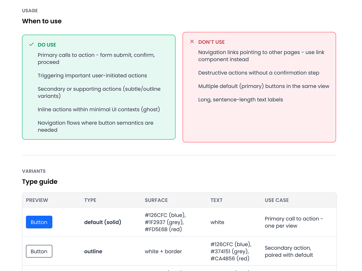
Button documentation
The shipped solution
The first usable version of the system shipped after about three months of work. It includes:
A full color scale built around our brand color, plus a complete set of system colors covering status, surface, border, and feedback states.
A semantic token system with two themes, light mode and dark mode. The base palette and the mapped layer were designed together so that mode switching works through token mapping rather than per-component overrides.
A component library of around 40 components covering primary, secondary, tertiary, and destructive actions, form inputs, navigation, feedback, layout, and content patterns. Every component is documented with its states (default, hover, active, focus, disabled) and sized variants where relevant. Several components carry additional variants for specific use cases, which means the real working count is meaningfully higher than the headline number.
A starter set of page templates that demonstrate how primitives and patterns compose into real product views.
The system continues to grow. New components are added every month as new product needs surface.
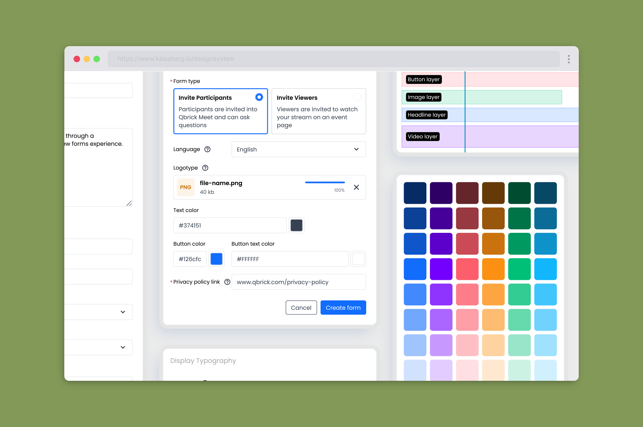
Primitives and patterns.
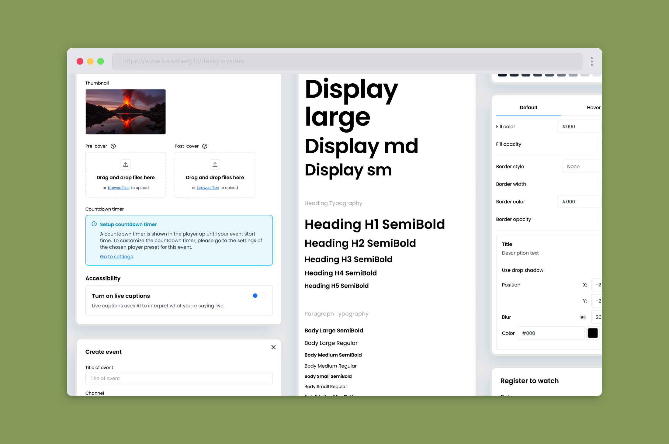
Primitives and patterns.
What happened after we shipped
Consistency across products. Components designed once now look and behave the same wherever they appear. Designers are no longer hunting through old files for something close enough to copy.
Faster design work. New screens start from a kit rather than from zero. Spacing, typography, and color decisions are made at the system level, not on every screen.
A shared vocabulary between designers and developers. Naming conventions are consistent across Figma and design conversations, which makes handoff and feedback faster.
A foundation for the next step. The design side of the system is stable enough that we can now have meaningful conversations about a code library and a Storybook implementation. That conversation wasn't possible before, because there was nothing concrete to point at.
Learnings
A few things I'll take into the next phase, and into any design system I build or work on in the future.
You can't fully design a token system in the abstract. You have to design it through use. Some of my biggest revisions to the mapped token layer came from building a component, testing it in dark mode, and realizing the tokens I'd planned didn't cover the hover state on a darker surface. Each round of dark mode testing exposed gaps I couldn't have predicted at the planning stage. The lesson: start small on components before token testing is completed.
A Figma library is not a finished design system. The system feels real to designers because we live in Figma. It does not yet feel real to developers, because we don't have a corresponding component library in code. Until we have a shared source of truth that lives in both places, developers still rebuild components from scratch, even when they're now rebuilding them consistently. Closing that gap is the next chapter of this work.
Buy-in is a separate discipline from building. The hardest part of this project wasn't the design work. It was making the case for doing the design work at all. Internal awareness of design systems was low, which meant I had to build the first version largely outside my normal scope to prove what it could do. With hindsight, I'd invest earlier in making the value visible: small before-and-after demos, time-savings examples, customer-impact framing. The work speaks for itself once it exists, but it can't speak before it exists.
If your company is still early, adopt an existing design system before you build one. Based on this project, my honest recommendation to any growing company is to pick a mature system like Material UI, Carbon UI, or Chakra, and adjust the brand layer (colors, typography, a few signature components) to make it feel like yours. The bones come for free, the documentation is already written, and you skip months of building what the industry has already solved. The window for this decision is narrow. Once a company's visual identity is established without a system, leadership becomes attached to what's already shipped, and migrating to an existing system stops being a feasible ask. At Qbrick, adopting wasn't on the table by the time the conversation reached me, so I built custom. If I could rewind the clock to the start of the company, that's the call I would push for instead.