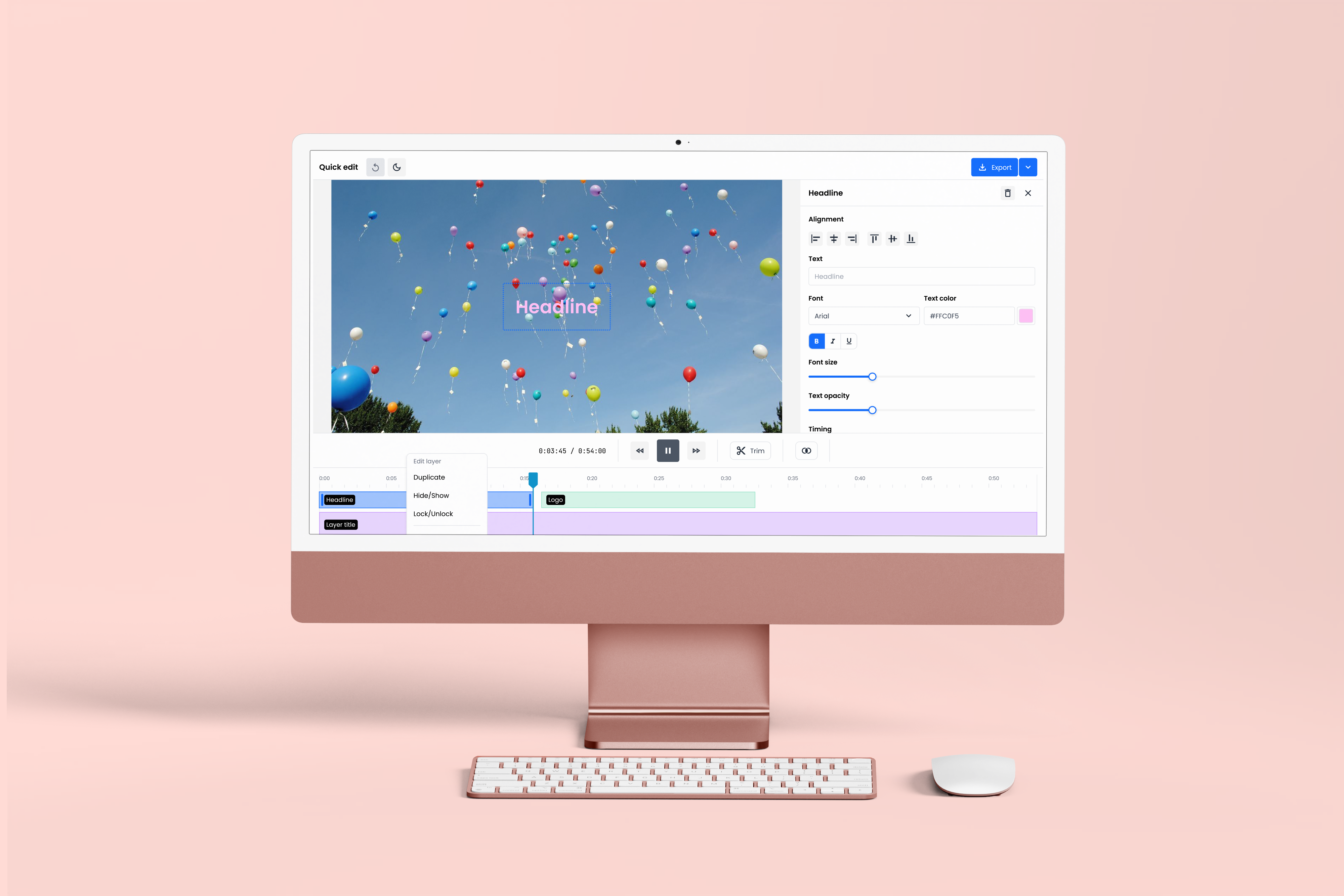
At a Glance
Quick Edit is an embeddable video editor. It gives customers a way to trim clips, add graphics, and publish, without opening a professional creative suite to do it. I designed it as a small, focused tool that can live inside my company's video platform or embed into a customer's own product. The whole design brief boiled down to one word that we protected the entire way through: simple.
Context
My company's platform used to include a browser-based video editor. It was built on an open source foundation that eventually went unmaintained, and keeping it alive became harder than it was worth. We retired it, and integrated Adobe Express as a replacement. Customers who wanted to edit could open Adobe Express from inside our environment.
On paper, this looked like a clean solution. We got a mature creative suite for free, our customers got real editing capability, and the company got out of the business of maintaining a video editor. In practice, it created a new set of problems.
The problem
Reselling Adobe Express meant we owned the customer relationship without owning the product. Account setup issues, licensing complications, service outages, and Adobe-side bugs all landed on us first. Customers complained to us, we escalated to Adobe, and the license reseller we worked through wasn't always quick to help. Leadership was spending an increasing amount of time in problem-solving meetings about issues we couldn't actually solve.
There was also a mismatch between the tool and the job. Adobe Express is a capable creative platform. Our customers weren't using it as one. They kept telling us the same thing: "We don't want to open up an Adobe Suite tool just to trim our clips." What they wanted was to trim in and out, sometimes combine two videos, sometimes add a text overlay, and move on with their day.
We had already built a small trim-only tool for exactly these cases, also called Quick Edit. But as the Adobe complaints kept stacking up, the picture became clear. We were absorbing the customer support cost of a tool we didn't control, and the tool itself was overbuilt for what most of our customers actually needed.
What We Had to Work Around
- Adobe outages that we couldn't control
- Being a license reseller was more time consuming than we thought it would be
- Constant "problem solving" meetings for customers who had license issues or needed guidance on how to use the tool
Decisions
The go-ahead came from one meeting too many. My CEO had spent months in customer calls that started with an Adobe Express complaint and ended with him promising to "look into it," knowing he didn't have the leverage to fix it. He came to us and drew a line. We needed our own editor. Something simple, something we controlled, something that covered the basic needs so we could stop having those meetings. That was the mandate.
Decision 01
Progressive disclosure through the FAB
The Question
How do we let users add graphics and other elements without making the editor look like a complex tool?
What I Chose and Why
Trimming is the main thing this editor does. Everything else is optional. If we lined up graphics, images, and text buttons across a persistent toolbar, we'd be signaling "this is a complex tool" the moment a user opened it. So we chose a single floating action button. A plus. When users are ready to add something, they open the FAB and see a dialog with the element categories: text, images, shapes. Users who only want to trim never see the extras. Users who want more discover them at their own pace. The plus button carries all the "there's more here if you want it" energy the interface needs, without any of the visual weight of a full toolbar.
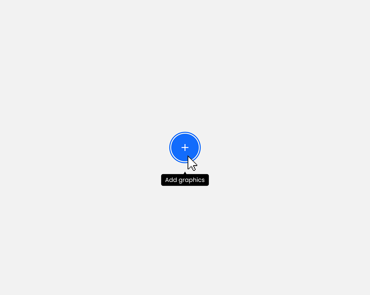
FAB.
Decision 02
Sliders over number inputs
The Question
How should users control size, opacity, and other continuous settings?
What I Chose and Why
Our customers are used to setting a font size to 16pt in a document. In a video, 16pt looks tiny. Number inputs invite users to fall back on the rules they know from PowerPoint and brand manuals, and those rules don't translate to video. Sliders force a different kind of attention. You drag until it looks right in the preview. There's no "correct" number to reach for, because there isn't one. This is a tool for feeling, not calculating.
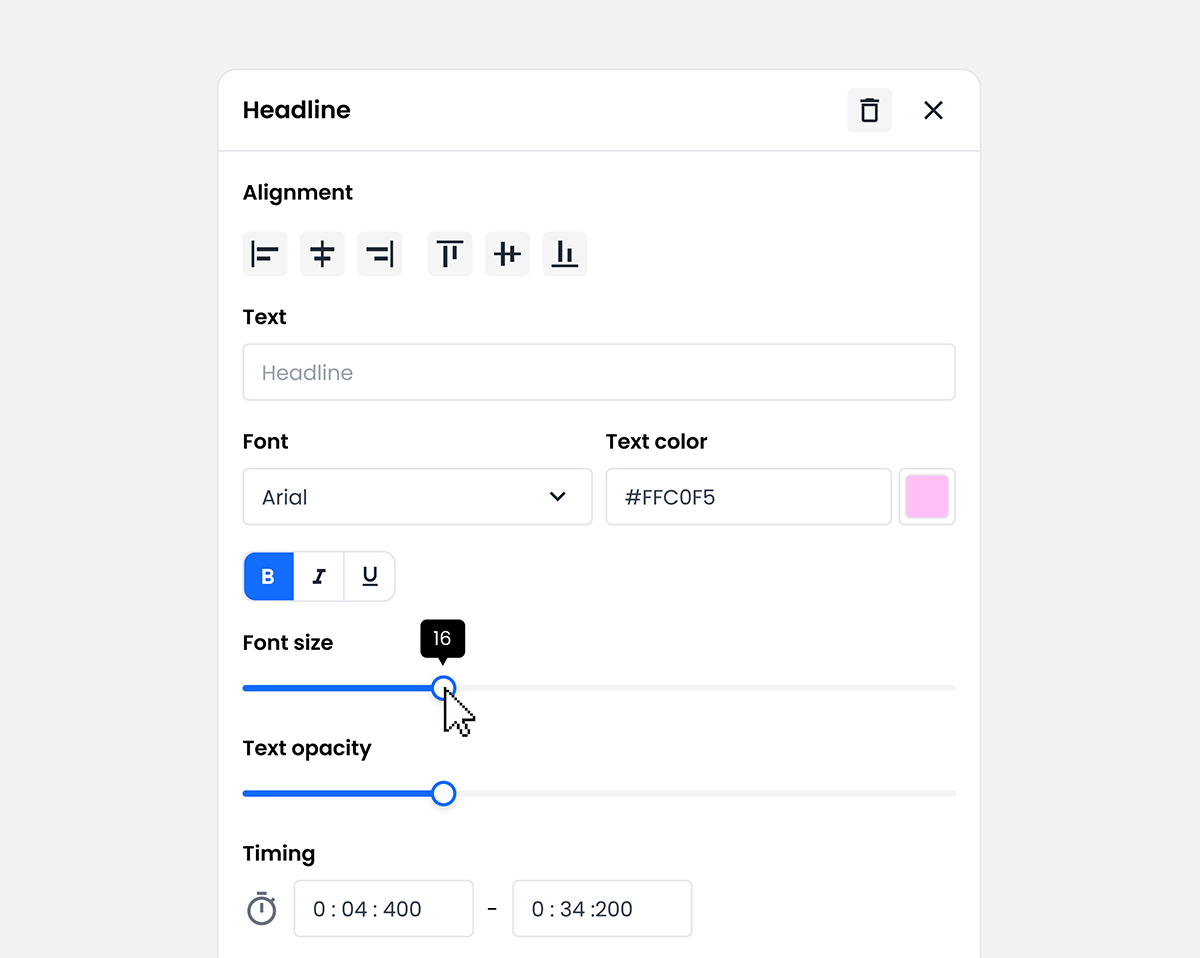
Sliders in the settings menus.
Decision 03
Direct manipulation in the video field
The Question
Where should users do most of their editing?
What I Chose and Why
Our customers already work with tools like PowerPoint and Keynote, where you position, resize, and adjust elements directly on the slide. That instinct transfers. When you click a graphic in Quick Edit, you can move it, resize it, and reposition it right in the video preview. Detailed settings live in a right-side panel that opens on selection, but the visual work happens where the visual result is. Fewer menus to dig through, more time actually looking at the video.
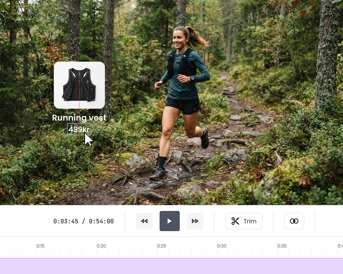
Free-move editing in the video window.
Decision 04
Dark and light modes from day one
The Question
How do we design an editor that can live inside someone else's product?
What I Chose and Why
Quick Edit is built to be embeddable. Our CTO designed the technical foundation so customers can drop the editor into their own internal systems and platforms. Which means we don't know what the surrounding environment looks like. We don't know whether it's dark, light, corporate, or playful. We designed for both light and dark mode from the beginning, so customers can match Quick Edit to their environment rather than the other way around. It's the first Qbrick tool where we treated theming as a core requirement rather than an afterthought.
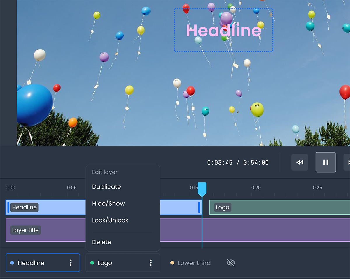
Dark mode.
The shipped solution
Quick Edit shipped as a browser-based video editor with a deliberately compact feature set.
The core capability is trimming, with in and out points that can be saved as a new clip or written over the original.
Beyond trim, users can add graphics (headlines, lower thirds, and paragraph text in several style options), shapes (squares and circles), and image uploads. Every added element appears as a layer beneath the timeline, so users who find the timeline chaotic can manage elements from a cleaner list, deleting or duplicating as they go.
Element editing happens in two places. In the video preview, users move, resize, and reposition graphics directly. In the right-side panel, they adjust color, font, alignment, opacity, outline, animation, and timing. Most numerical controls use sliders. Timing is adjusted on the timeline. Everything else is direct manipulation in the video field.
The editor supports light and dark mode, chosen at the container level. It's designed to run inside Qbrick's platform or embed into a customer's own product.
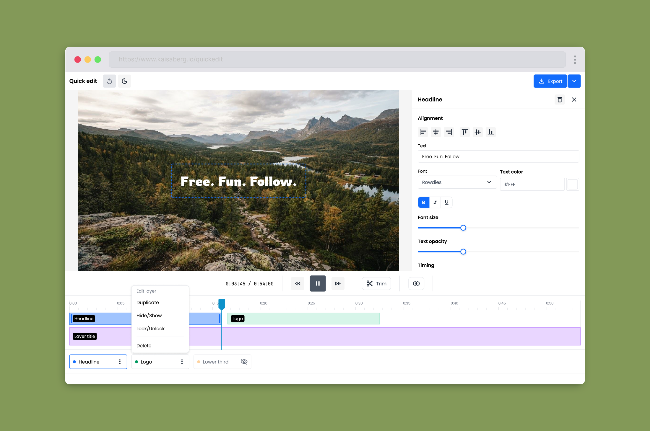
Editor.
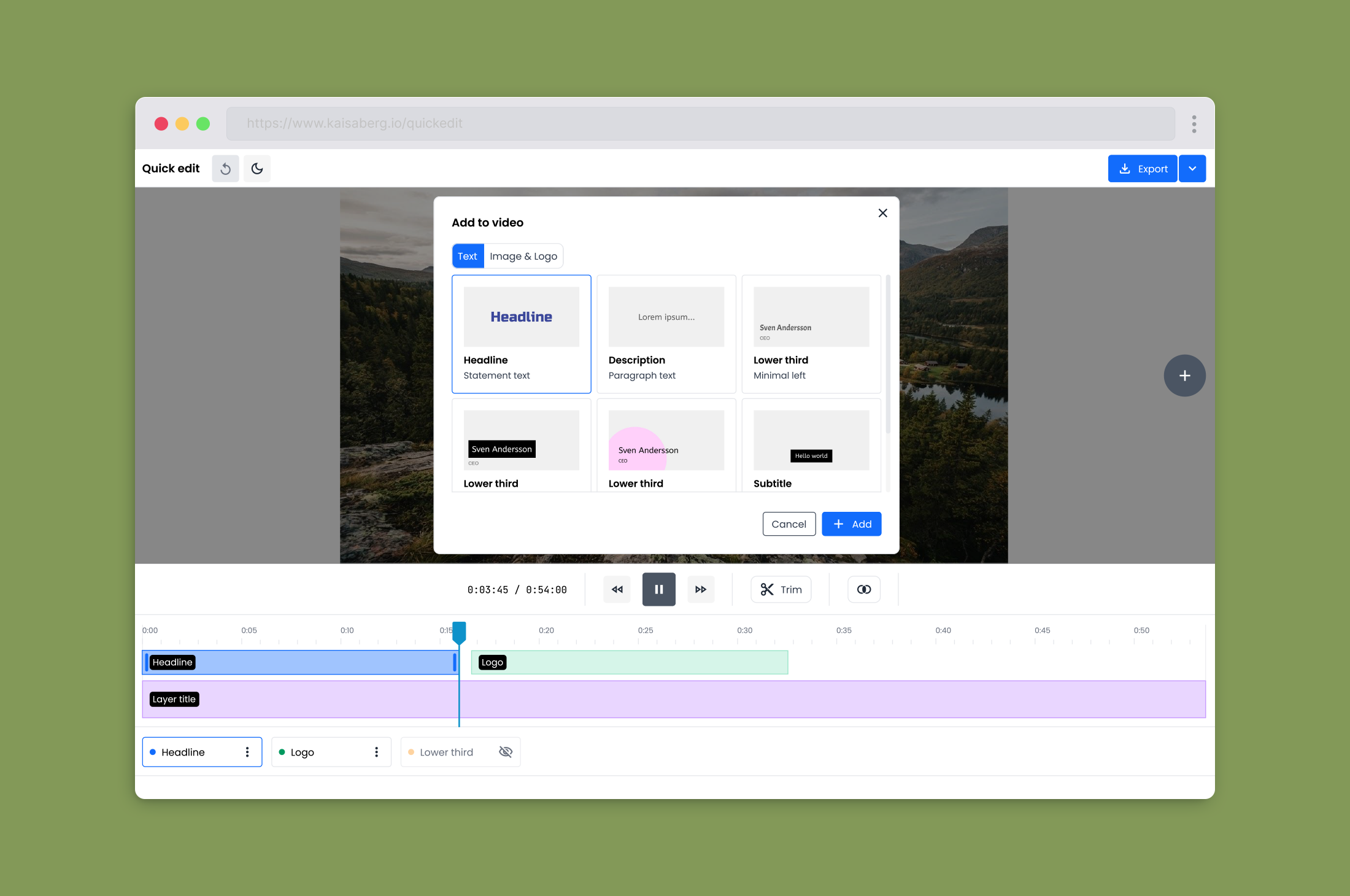
Add to video dialog.
What happened after we shipped
Adoption from the tool it replaced. About half of our Adobe Express users have moved to Quick Edit, and the feedback we're hearing is that the tool fits their actual needs. For the customers who moved, editing is no longer a task that requires opening a separate creative suite.
Fewer customer support fires. The problem-solving meetings about Adobe issues have quieted down. Customers with simple needs are getting a simple tool. When something goes wrong now, it's a problem we can actually fix.
A pipeline of requests, which is a healthy sign. Users have started asking for more: clip transitions, multiple videos on the timeline, a few others. That kind of engagement only shows up when customers are actually using the tool. We have a queue of thoughtful additions to work through.
A tool ready for its next context. Because Quick Edit was built embeddable from the start, we now have a video editor that can live wherever a customer needs it to. That's a different kind of product surface than anything else in the Qbrick platform, and it opens conversations we couldn't have had before.
Learnings
Keeping a video editor simple is the hardest thing about designing one. I've designed several video editors in my career, and every one of them accumulated features until it stopped feeling like the tool it started as. Customers ask for things. You add them. Each addition looks reasonable in isolation. Ten additions in, you've built Adobe Premiere by accident, and nobody's happy, because nobody knows how to use it. Quick Edit is the first video editor I've worked on where we made the "keep it simple" promise and actually kept it, from the first sketch through to shipping.
The way to honor a customer request is not always to build what they asked for. Every feature request is a signal about what the customer is trying to do, not necessarily an instruction for what to build. When customers ask for clip transitions, the underlying need is often "make my edits look more polished." That doesn't require the same solution a professional editor would use. The design work is figuring out what the request means, then finding the smallest version of a solution that keeps the tool feeling like itself.
Not every good idea makes it in. We initially designed a context menu that would appear in the video field when you clicked on an element, so users could change color or font size without opening the full settings panel. We loved it as an idea. In practice, our CTO couldn't build it well in the timeframe we had, and the version we prototyped kept getting in the way of direct manipulation. We saved it for a future release when we have more engineering capacity. Cutting good ideas is part of shipping a simple tool.
Designing for embeddability changes every decision. When your tool has to live inside someone else's product, every default becomes a bet. Which theme, which layout, which language, which conventions. Dark and light modes from day one were the obvious first step. The deeper lesson is that embedded tools have to be more opinionated about their own core, and less opinionated about their surroundings. Every visual decision has to survive being dropped into a context you never designed for.