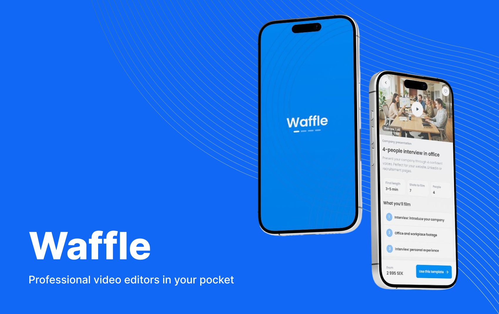
Background
Our customers needed video, big and small. For big productions, they hired my company’s internal production team. But for small ones – a company presentation, an employer branding clip – they didn’t want to pay full production costs. So they filmed and edited themselves, the quality dropped, and they waited to call the professionals until they had budget for something big.
That was a problem for us too. A video platform (which was my company’s main product) is only valuable if you keep making videos. Customers without a steady flow of content had no reason to stay.
The idea
An app where businesses film the footage themselves, following a template, and a professional editor finishes the video. Lower cost for the customer, professional quality, and a steady stream of videos into our video platform.
The guiding principle: Guided
Our users weren’t videographers. They were marketers, HR people and communicators, filming on their phones, often for the first time. Qbrick’s production team had years of experience with exactly this, and three lessons stood out: 1) set expectations (editors aren’t magicians), 2) enforce templates, and 3) make file sharing part of the conversation.
So every screen in Waffle had one job: tell the user exactly what to do next, and what will happen after. Like having a producer by your side.
One of our main inspirations for the app was Fiverr, an online marketplace for creative digital services, who had built the groundwork for purchasing creative services as products.
“The novelty behind Fiverr’s unique approach is making the experience of buying a digital service as easy as shopping on Amazon”
— Micha Kaufman, Co-founder and CEO of Fiverr, on the concept behind the service.
Design decisions
Start with what you want to make
People don’t open a video app thinking “I need a template”. They think “I need a recruitment video”. So the app starts with the outcome, not the tools.
Example
Search first
The first thing you see is the question “What do you want to make today?” and a search field – the same way Fiverr starts its journey. Categories and popular templates sit right below for those who’d rather browse.
Continue where you left off
Filming takes time, and few finish in one go. An unfinished project is always the first card on the start screen, with progress shown in shots done.
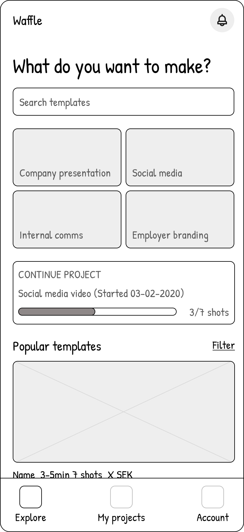
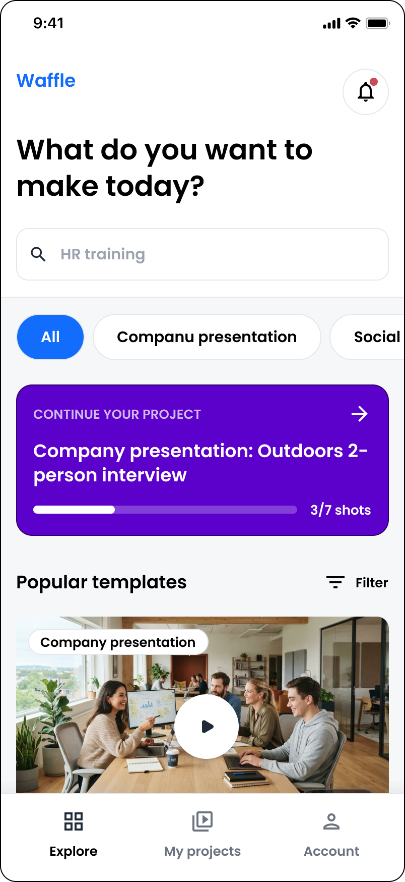
Wireframe → Finished design: Explore screen
Set expectations before anyone pays
The first insight from our production team was to set expectations before a project is even started. Editors aren’t magicians (only almost). With the raw footage being filmed by our users, and probably on phones with variable quality, users need to know exactly what they can expect before they commit.
Example
The template page
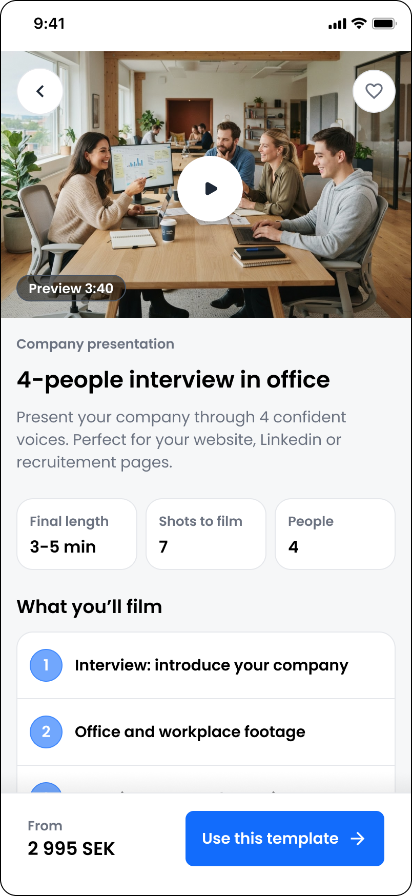
Every template shows a preview, final length, number of shots, how many people are needed, the full list of what you’ll film, and what you’ll need – before you choose it. Each preview, according to our plan, also needed to match a realistic view of what the final product could look like.
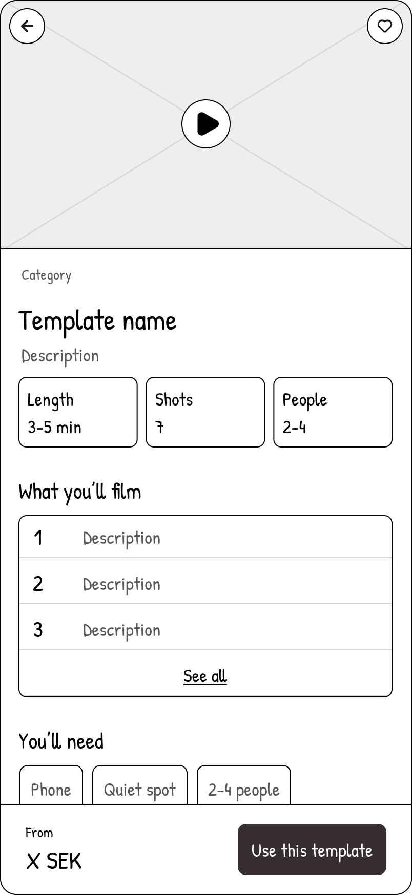
Wireframe → Finished design: Template detail page
A guided experience all the way through
A template is only useful if it’s followed. Instead of a blank upload area, the order process works like a checklist that always tells you what’s next. Production can be seen as “scary”, especially if you’re inexperienced. Our app needed to educate, lead and encourage the user.
Example
The shot list
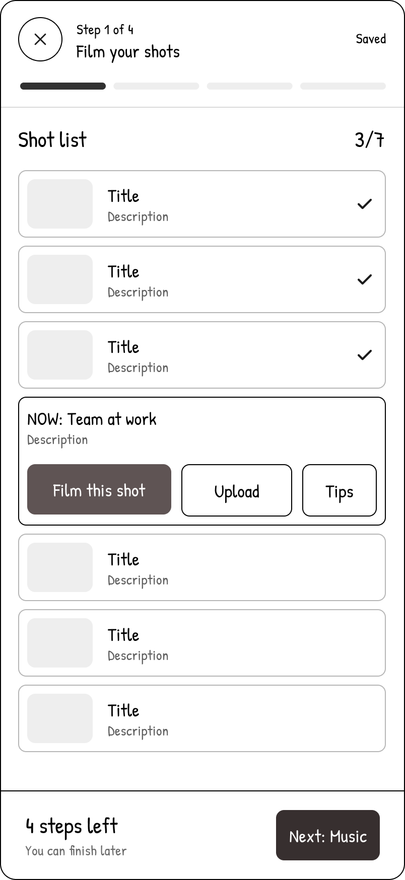
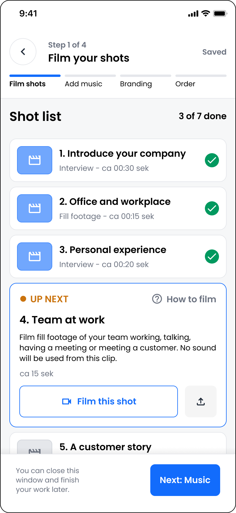
Each shot has a title, a description and a target length. The next one is highlighted as “Up next”, with buttons to film it in the app or upload it, and tips on how to film (with preview clips as inspiration).
You can stop anytime
A labelled stepper shows where you are (shots, music, branding, order), progress is saved automatically, and the footer reminds you that you can close the app and finish later.
Wireframe → Finished design: Shot list
Keep the conversation with the editor in one place
Our production team gave us insights on how the customer to editor relationship works, and how it has to be an open conversation. Ideas might come up mid-journey, and delivery notes might require extra files being sent.
Example
The chat
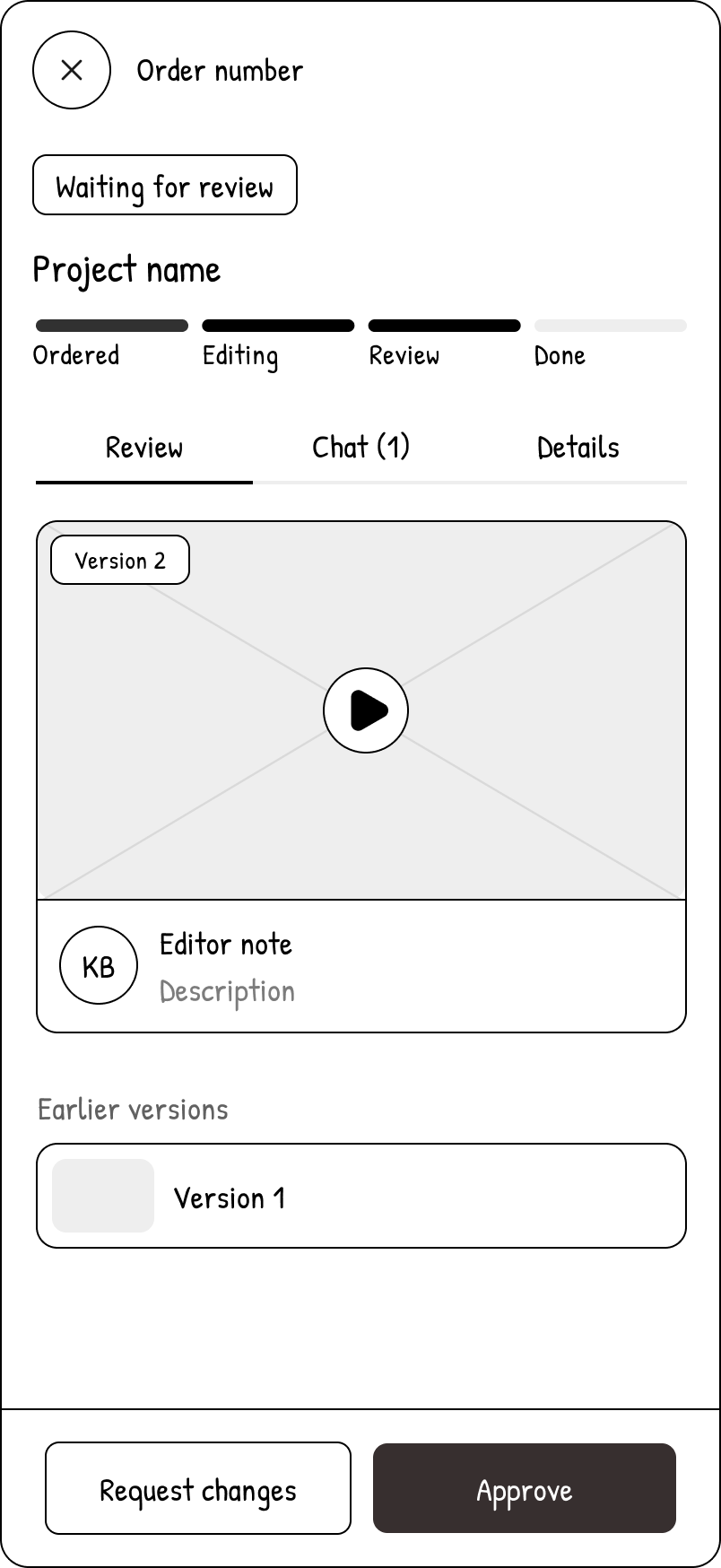
On the delivery page, the user sees status, a dated stepper (ordered, editing, review, done), the latest version with a note from the editor, messages, and earlier versions. At the bottom: approve the video or request changes.
The chat is always available, but only highlighted when a new message or delivery has been sent by the editor. Files, notes, critiques and cheers are all sent via the chat.
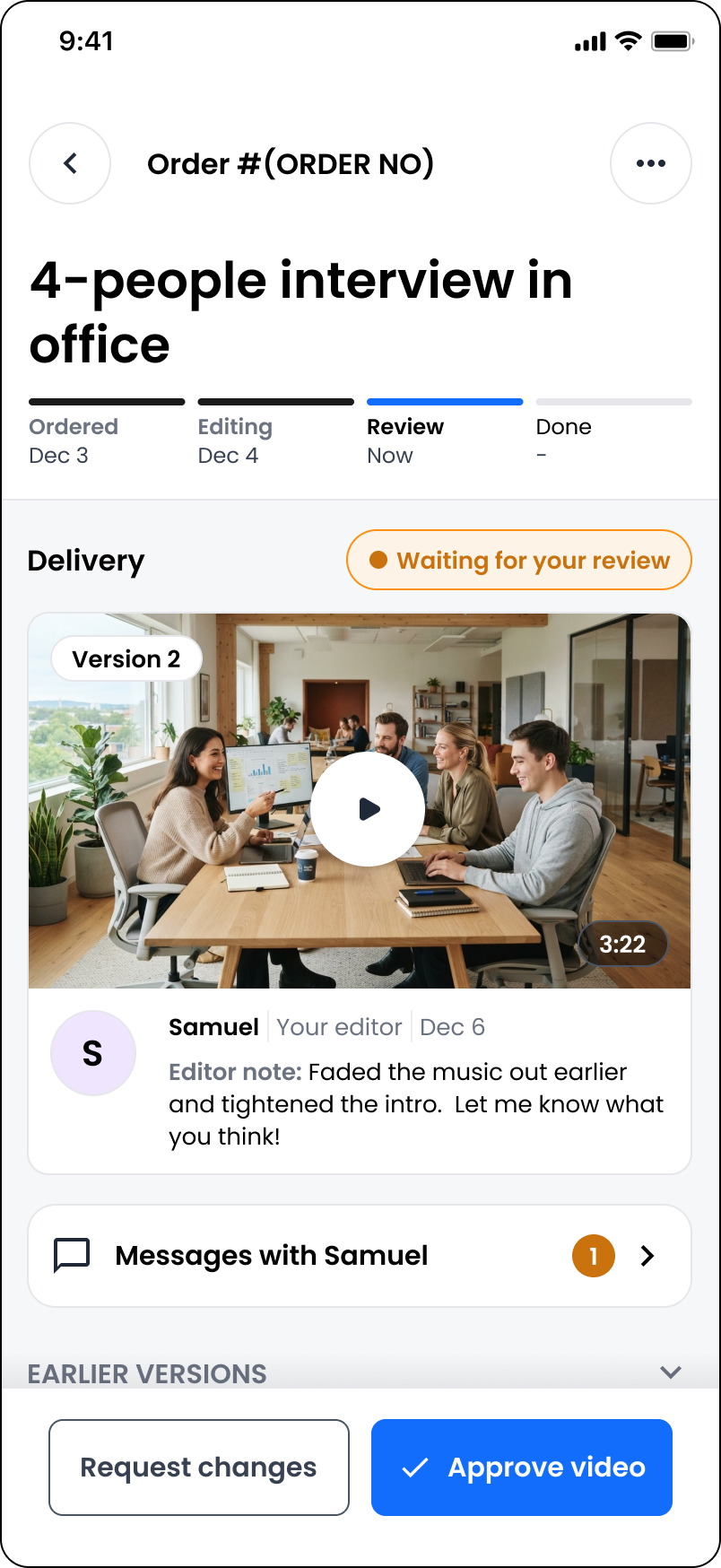
Wireframe → Finished design: Order in process
What we left out
We left out card payments. Our customers were businesses that already paid by invoice, so we started with invoicing to the company’s billing address, and saved in-app payments for a later version.
Finished product
I wanted Waffle to feel like Qbrick, but as a modern consumer-style app. So I built it from Qbrick’s components, with rounder edges, more use of colour, and a simple guided experience.
Impact
Investor interest
Investors liked the idea of a digitised production company, and there was interest in going further – for example hiring production teams for projects outside the templates.
Put on ice
Priorities changed. As Qbrick prepared for its IPO, Waffle was put on ice. Later, as generative AI became the focus, manual production services were no longer the direction.
What I learned
Design for the business, as well as for the user. Waffle solved a real user problem, but its strongest argument was the business one: keeping customers active on the platform. When the company’s direction changed, that argument had to be made again. Today I make sure both the user value and the business value are written down and measurable from the start, so a project can defend itself when priorities shift.