Qbrick design system, a shared language for a complex video platform.
Designing the foundation a fast-moving team needed, but didn't know to ask for.
What happens when a fast team has no shared language?
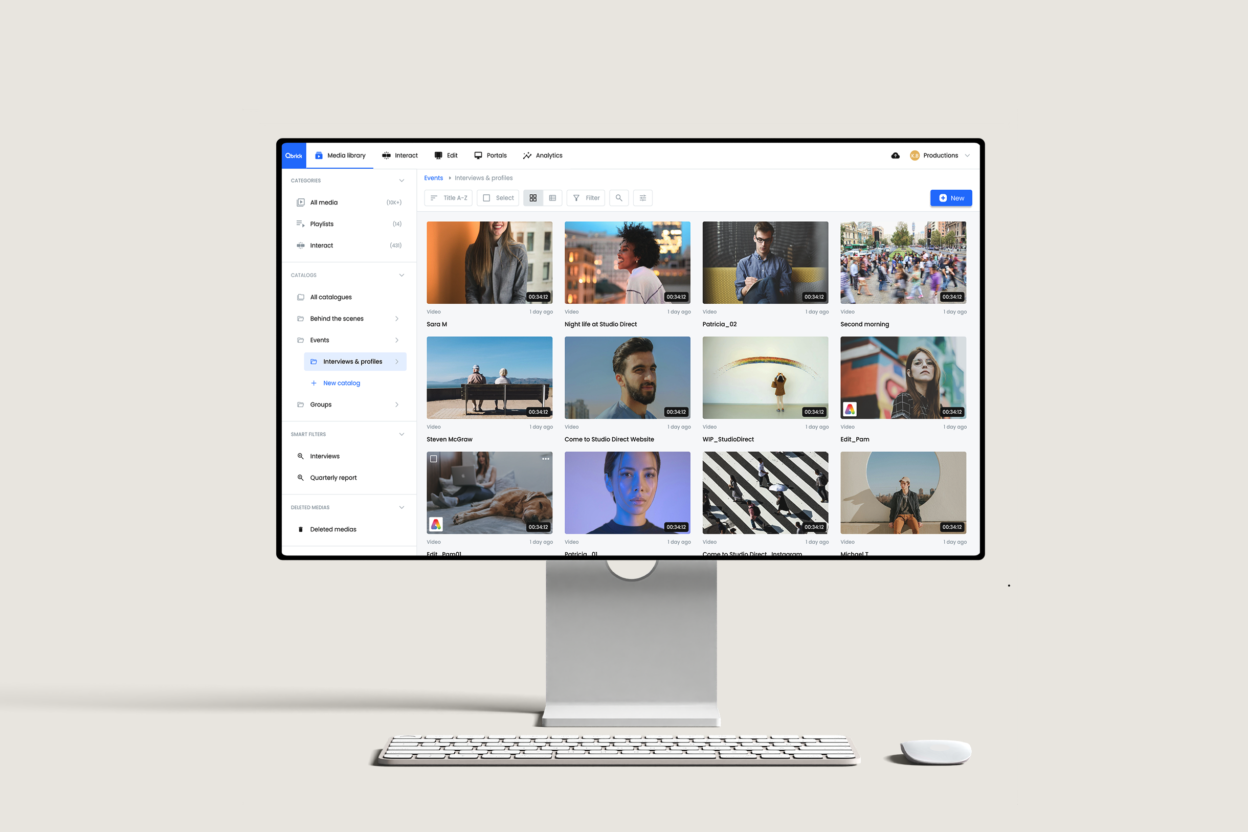
Qbrick moved fast and had no shared visual or component language. Developers built components from scratch or borrowed public libraries, so buttons, modals and inputs looked different in every product. Designers had no tokens, no scales and no shared library. Customers met inconsistent patterns, like one product asking for an image upload and another for a URL, and support spent a lot of time guiding them.
Then my closest collaborator, our PM, was leaving, and leadership wanted more features, faster. Onboarding anyone new into the way we worked felt close to impossible.
"A design system isn't a project. It's a product serving products."Why the work keeps going after the first release.
100% Qbrick.
Qbrick already had a look of its own, and the system was built to protect it. Every component was informed by bigger design systems, but visually everything is Qbrick's own: its colours, its shapes and its feel.
Tokens that describe intent
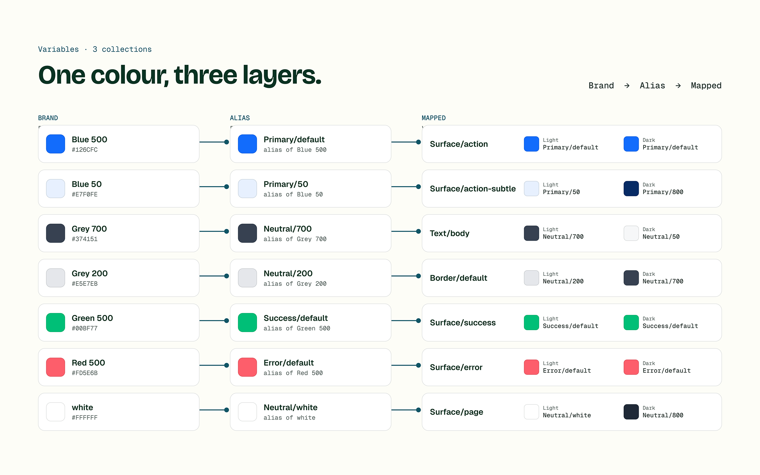
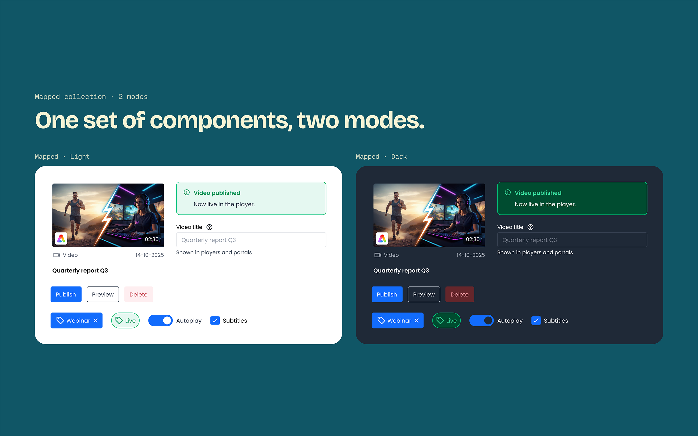
A base palette sits underneath a semantic layer with names like surface-default, hover and hover-light. When the brand colour changes or a new use case appears, only the mapping changes, and the components stay untouched.
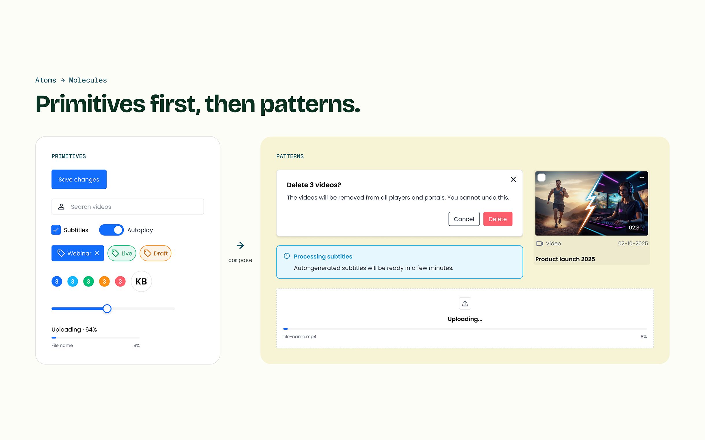
Primitives before patterns
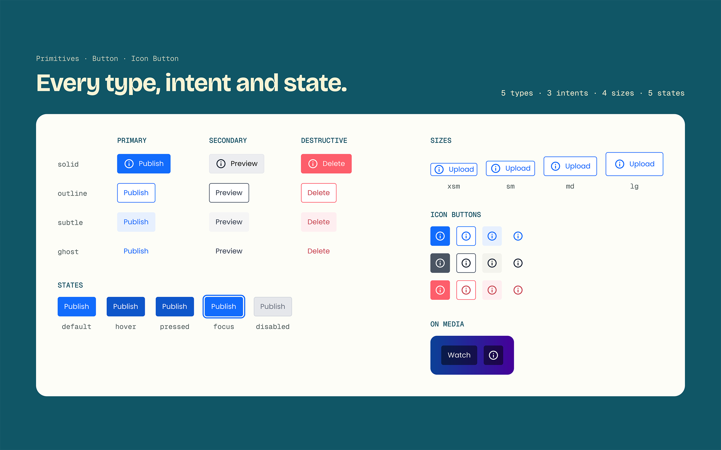
Buttons, inputs and labels came first, then forms, cards and tables. That way every decision about a pattern rests on primitives that are already finished, instead of guesses.
Borrow the logic, not the look
Adopting an existing system would have meant giving up Qbrick's identity, which leadership wanted to keep. So I used Carbon as the model for how things work, borrowing its documentation, component logic and state naming, and designed how everything looks myself. As the only dedicated UX designer, I owned every decision, which was the fastest route to consistency.
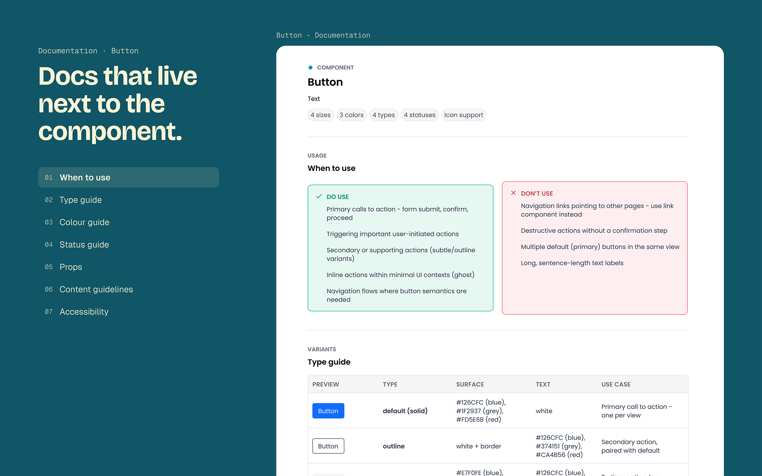
Documentation where we work
Most documentation lives inside the Figma components themselves, and only the most complex components have their own written docs. It was the quickest route to something usable, and it is also where the system has the most room to grow.
What we left out
A code component library. There is no Storybook yet, so developers still rebuild components in code, and most components have no written documentation beyond what lives in Figma. Shipping a usable Figma library first was the fastest way to consistency. Connecting it to code is the next step.
The first usable version shipped after three months.
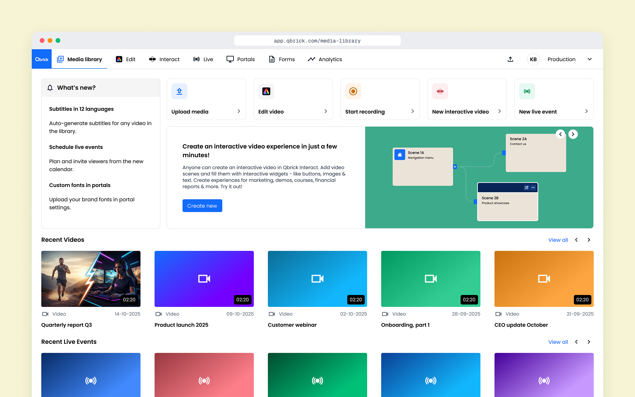
Figma · Light and darkA full colour scale around the brand colour plus system colours for status, surfaces, borders and feedback. Semantic tokens with light and dark modes. Around 40 components, each with its states and sizes, and a starter set of page templates. New components are added every month.
A Figma library is not a finished design system.
Tokens can't be fully designed in the abstract: testing dark mode exposed gaps, like hover states on darker surfaces. The system feels real to designers but not yet to developers, so one shared source of truth is the next step. And if your company is still early, adopt an existing system and customise the brand layer before you build your own.